Powerful Logo Color Combinations That Transform Brands (With Examples)
The right logo colors can elevate your brand from forgettable to iconic. Explore combinations with examples and insights on why they succeed.
 March 17, 2025
 10 minute reading
Most humans can see up to 10 million different colors, but this number varies depending on the person. Adobe’s color picker can have even more than this, with over 16 million color values.
With so many hues out there, how do you choose a winning color combination for your logo? It can seem like a daunting task, but it doesn’t have to be.
If you want a logo that’s iconic, rather than forgettable — get inspiration from those who have got it right. Successful companies use color theory to make graphic design decisions, and you should too.
In the following guide, we’ll talk about the best logo color combinations. And, we’ll share examples from real brands.
Let’s jump in.
What is logo color theory?
Colors can make us feel different emotions. Graphic designers understand this and use color psychology to choose the right palette for the target audience. In 1666, Isaac Newton invented the color wheel to show how colors interact with each other, and we still use it today.
Let’s say your customers are young (or young at heart). Bold colors like pink, yellow, or red-orange may be the perfect match. Or, if you sell a high-end product such as jewelry or luxury vehicles, gold, black, or purple scream luxury.
Remember, the way people feel can also depend on their cultural background. Consider the location of your target audience before settling on a logo color scheme.
For example, in most countries, yellow and orange are happy hues. But, in Russia, they can signal danger. Then there is red, which is a strong, fiery, and passionate symbol in Western cultures. However, in Japan, red is a calm color.
Why choosing the right logo color combination matters
Logos are often the first addition to a branding toolkit, and all your marketing efforts will center around it. So, take the time to get it right.
You want to give your customers the right impression, and this starts with your business colors. Think about how you want people to feel when they think about your brand. Do you want your name to be known as vivacious and energetic? Or is the goal to make your audience feel calm and secure?
The colors you choose can represent your brand without words. Look at Cadbury, known for its purple and gold logo. And we all know Coca-Cola is bright red and white. Mattel is hot pink. John Deere is green and yellow, and Tiffany & Co. has its shade of light blue.
Proven logo color combinations
Get set for a rundown of some of the best logo color combinations. Each includes an existing brand so you can see how they work in the real world.
Black and gold
Black and gold is a sophisticated choice. These colors are a good fit for brands that are luxurious, glamorous, and exclusive. Nearly 16% of companies use gold in their branding, while 28% have black or grayscale. If you put the two together, it can be a winning combination.
Let’s look at Lamborghini, the super sports car manufacturer. The iconic bull logo was updated in early 2024 to showcase the brand's “innovation and determination.”
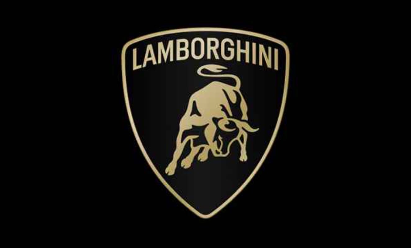
Lamborghini
Gold and black have always been the go-to colors for the Italian “Lambo,” and they’re still featured in the refreshed design. Lamborghinis are expensive vehicles that make a statement, making black and gold the perfect choice.
Blue and orange
You’ll find blue and orange on opposite sides of the color wheel. These hues are complementary, and if you get the balance right, your logo will create an impact.
You may recognize this logo for the web browser, Mozilla Firefox:

Firefox
This logo has changed over the years and has featured both the red panda mascot (commonly called a firefox) and a regular fox. Despite the animal confusion, there has been a consistent color scheme of blue and orange.
This duo is bold, modern, and easy on the eye. Orange is energetic, warm, and enthusiastic, while blue is trustworthy, calm, and imaginative. This makes the combo perfect for a tech brand that wants to show it's both innovative and secure.
Find logo design services on Fiverr
Red and white
Red is a strong color that can make people feel big emotions. For example, this hue can symbolize power, love, energy, and action.
It can be overpowering in large doses, but you can get all the strength and excitement of red without scaring your customers away. How? By toning it down with white.
White is neutral and symbolizes purity, innocence, and simplicity, and it contrasts with red. There’s a long list of leading companies with red and white brand colors. For example, you’re probably familiar with Adobe, and Canon.
Then, there’s retailer Target with a literal bullseye logo in red and white.

Target
The logo is eye-catching and easily recognizable, even without the word “Target.” The message is that the store is exciting, affordable, good quality, and trustworthy.
Green and brown
Green and brown are colors straight from nature. When people see this color combination, the first impression is usually that the products are natural, eco-friendly, and sustainable.
Green is peaceful, harmonious, and fresh, and there are a range of shades to choose from. Think olive, sage, mint, jade, and forest green. Brown signals stability, warmth, and comfort.
With a name like this, coffee brand Green and Brown had little choice but to use the color duo in the logo.
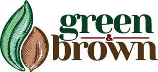
Green & Brown
This brown and green logo emphasizes the company’s message that the coffee is high-quality, premium, and naturally grown.
Remember, this combination is best suited to eco-friendly and organic brands. These colors may fall flat in other industries.
Pink and gray
Pink and gray is another popular color scheme. It’s often used by companies with a female target audience, including healthcare, fundraising, and beauty industries.
Pink is feminine, and humans associate it with love, romance, tenderness, and care. Pairing it with gray tones down the pink, and adds a splash of sophistication.
Causes that raise money for women with cancer commonly use hot pink. For example, Think Pink Foundation has a wellness center to support those with breast cancer:
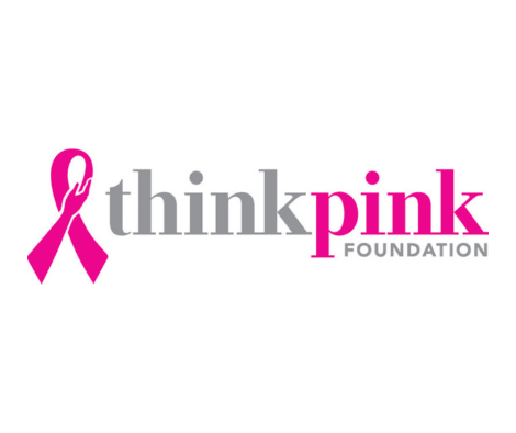
ThinkPink Foundation
This gray and pink logo shows compassion and professionalism. The pink ribbon is what we would expect from an organization that supports those with breast cancer, while the gray reflects the seriousness of the disease.
Of course, pink is also a popular color for other successful brands. Barbie, Lyft, and Donut King all use this playful hue in their logos.
Yellow and purple
Purple is a secondary color, while yellow is a primary color. The two sit opposite on the color wheel, which means they are complementary.
Just like blue and orange, pairing yellow and purple gives you a high-contrast logo design. Purple is more luxurious, and is often associated with royalty, wealth, and power. Purple can also be creative, innovative, and magical.
The LA Lakers have a recognizable purple and yellow logo. This color pairing has been part of the team’s brand identity since 1967.
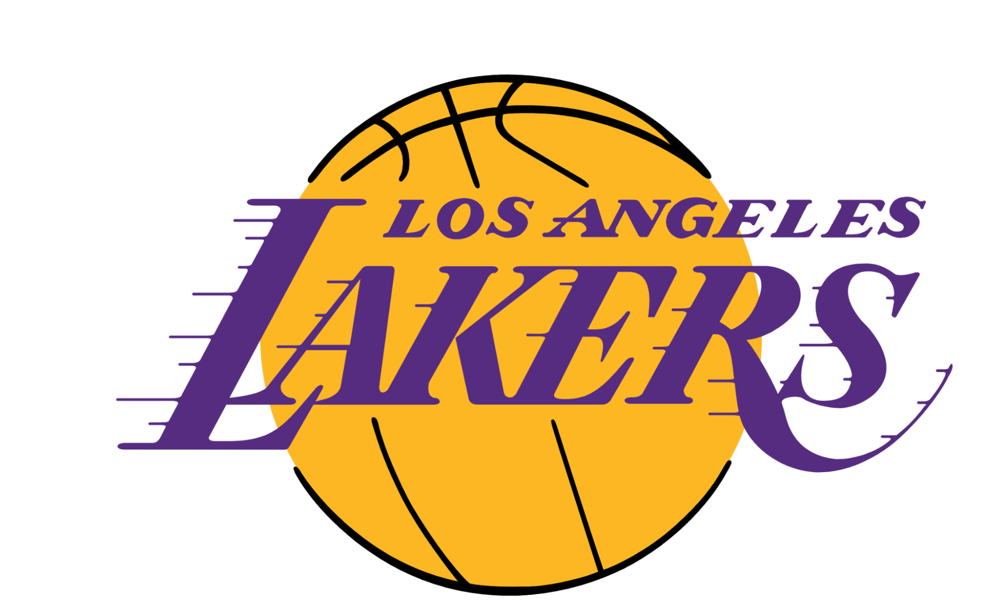
LA Lakers
Former owner of the Lakers, Jack Kent Cooke, chose this color combo because it is regal and represents the success and quality of the team.
Find a logo designer for hire
Navy and teal
Navy blue and teal are cool colors, which are considered calm and relaxing. Navy blue is neutral and works well for brands that want to be seen as elegant, professional, and dependable. This is why companies such as Ford and Gap are fans of this color.
Then, there is teal, which is the perfect accent color. It can mean tranquility, openness, and trustworthiness. You can also try aqua, which gives a similar effect.
Let’s look at Ellie Diagnostics, which has a dark blue and teal logo. The design itself is simple and clean — a good fit for a veterinary laboratory:

Ellie Diagnostics
With this combination, Ellie Diagnostics is helping to build its reputation as an industry leader. This pairing shows the organization is clinical, organized, and safe, which are essential traits in research and healthcare.
Monochromatic gradients
Monochromatic means one color, and this can be a good strategy in logo design. Over time, customers will associate this one hue with your brand — just like Starbucks (green) and Nickelodeon (orange).
But, a single color can feel flat, especially if the brand’s message is innovative and fresh. Mix it up with gradients to modernize your logo, with light to dark or vice versa.
Want inspiration? Take a look at the Canva logo with script lettering that goes from light to dark.

Canva
Until 2021, the Canva logo was solid turquoise. The addition of a gradient put new life into the previous design. It shows the brand is creative and modern, with solutions that are made for creativity.
The psychological impact of color combinations
Once you know the type of message you want your logo to convey, choosing colors will be a breeze. Here are the top options to consider depending on how you want your customers to perceive your brand.
Colors that convey trust and dependability
If you want to show your customers that your company is professional, trustworthy, and reliable, try these colors:
Blue
Green
Black
Gray
White
Graphic designer Anna Cheah says,
“In logo design, blue is the most commonly used to convey trust and reliability. Especially in industries like banks and technology companies. For example, Visa, PayPal, and Facebook.”
Colors that evoke energy and excitement
Do you want to create excitement around your brand? Colors that are energetic and fun include:
Red
Orange
Yellow
Gold
Remember, warm colors can become overwhelming, so offset them with a neutral such as white.
Colors that create a sense of luxury
If your company is luxurious and exclusive, these colors will send the right message:
Purple
Royal blue
Black
Gold
Silver
Luxury and timelessness go hand in hand, so try to avoid trendy colors and stick to the classics.
Find an e-commerce logo designer on Fiverr
How to choose the best logo color combination for your brand
Now it’s time to get to know your brand and decide what should be included in your logo color palette.
Use these tips to find the perfect color scheme:
Understand your brand personality
Because colors can influence mood and behavior, it’s important to understand your brand’s personality and goals. For example, if the logo is for a bank or real estate agency, you need colors that say “We are serious, trustworthy, and professional.” In this case, you may choose a combination of blue, green, white, black, or gray.
Here is an example from American Express (Amex):

American Express
But, if the logo is for a quirky t-shirt or cosmetics brand, you can have some fun with it. A pop of yellow, pink, or orange paired with a neutral will showcase the playfulness of the company.
Remember, fonts can have an impact, too. Established typefaces such as Times New Roman are better for traditional businesses, while curvy fonts will give you a retro vibe.
Consider your target audience
When creating a logo, don’t forget to research your target audience. Just because you love something doesn’t mean it'll hit the mark for your customers.
Your market research can include surveys, web analytics, social media, and focus groups. Try to find out the needs, wants, and behaviors of your audience, as well as their age and location. With this information, you can start to pinpoint which colors will work and which ones won’t.
Keep in mind that 55% of people prefer a simple design, and 52% say they like bold colors.
Align with industry trends
While you should never copy a competitor, you can still get inspired by other brands in your industry. For example, baby photographers often use pastel colors, because they are soft and comforting.
And, many restaurants have a splash of red in their branding kits. Why? Red is said to stimulate the appetite. Green is another good choice because it represents freshness.
Styles and color trends change over time, so don’t be afraid to revamp your logo if it starts to look tired.
Test your color palette in different contexts
Finally, think about where you will be using your logo. Your color palette should be versatile and look good in a range of settings.
For example, the colors need to look good on-screen, from ecommerce websites to social media. Before you commit to a design, check that your logo is appealing on different devices.
The colors should also be suitable for printed documents and other physical branding, such as tags, bags, and signage.
Hire logo designers on Fiverr
Logo design is an art, and it isn’t as simple as throwing shapes onto a page. Get it right the first time with a professional logo designer.
Find a logo designer for hire
Browse Fiverr to find a graphic designer that matches your style, timeline, and budget. Read reviews from real customers, and communicate with the secure messaging app.
Want it instantly? Try the free logo maker.
FAQs about logo color combinations
What are the best color combinations for logos?
The best color combinations will depend on your industry. Complementary colors create contrast and make a visual impact. These combos include blue and orange, yellow and purple, and red and green.
How does color psychology impact logo design?
Colors can influence purchasing decisions and shape the way people feel about a brand. By using color psychology, designers can create a logo that appeals to the target audience.
Can I use more than two colors in my logo?
Logos should be simple, and many leading brands use one or two colors. For example, Starbucks's green logo is down to earth, while Coca-Cola's is energetic with its red and white.
While we recommend having less than three colors in a logo, Google and eBay both have 4. So, this rule can be broken if you find the right design.
What tools can help me choose logo colors?
The color wheel is a good place to start because it shows the relationship between all colors. But, if you want a simple alternative, take the Fiverr logo maker for a spin or try Hubspot’s color palette generator.
Related Guides


I have over 8 years of experience writing quality, SEO friendly content. I live in a beautiful regional town in Australia with my husband and three children. I can write confidently in both Australian and US styles and can give you the tone of voice that best suits your brand. Working in a digital agency has given me the opportunity to grow my skills and I can write about almost anything! Don't believe me? Give me a challenge! I look forward to working with you. Anna
