The Ultimate Guide to Logo Redesign
Learn about when you should consider a logo redesign. Packed with design tips and examples from popular brands.
 February 18, 2025
 13 minute reading
A logo represents your brand. It’s often the first thing customers see, so it needs to be memorable and relevant.
But what if your current logo design isn’t quite right? Maybe it’s stuck in the past, or it no longer reflects the products and services that you offer. If it’s time for a change, consider a logo redesign.
You wouldn’t be the first business to have a logo makeover. Everyone from Pepsico to Amazon and Adidas has changed things over the years.
So, when should you do it? And what should you consider in the new design? In the following guide, we answer both these questions and share examples from well-known brands.
When to consider a logo redesign
Consistent branding is important, but an old logo may be letting you down. How do you know when it’s time for something new?
If any of the following circumstances relate to your business, your logo may be due for an update:
Changing brand name
Companies change their names occasionally, and this rebranding process comes with a new logo.
Plenty of big players have changed brand names. Did you know Google was called “BackRub” in 1996?
The original logo was nothing like the one we know today. Instead of the iconic white background with “Google” in blue, red, yellow, and green, the logo was a photo of a hand with the company's name on top.
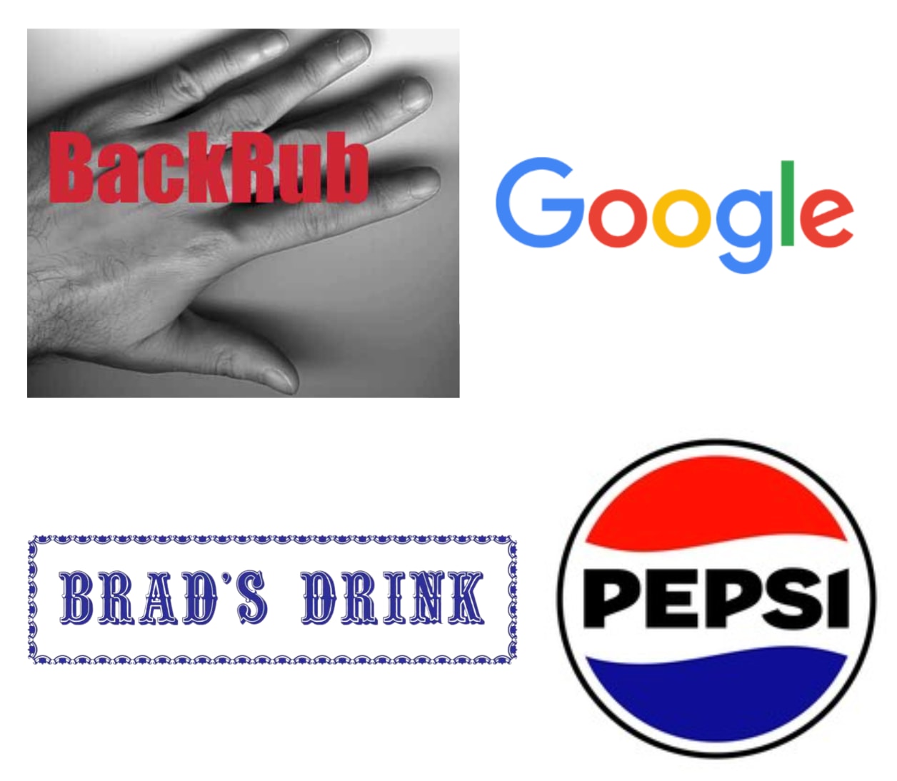
Google and Pepsi
Another example of a name change is Pepsi-Cola. The original name in the late 1800s was Brad’s Drink, after creator Caleb Bradham.
Repositioning company
If you want to update your products or services or attract a different audience, a new logo can support your efforts.
One company that has been through changes is Amazon. In the beginning, the focus of the online marketplace was books. The original logo was the Amazon River with the letter A and the brand’s ecommerce website.
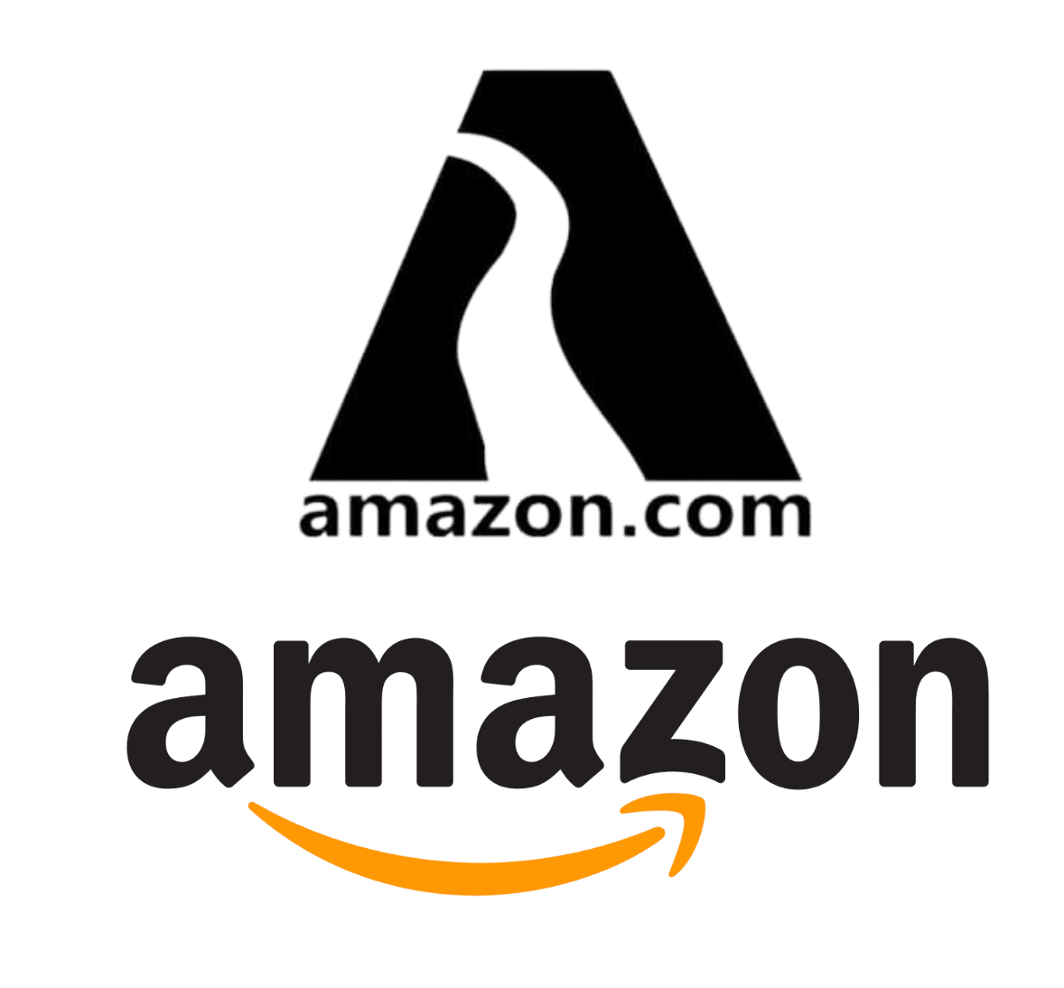
Amazon
There have been multiple types of logos along the way, but today it has a happy splash of orange. The arrow points from A—Z because it’s no longer just about books — you can now buy almost anything there.
Mergers can also mean it’s time for a new design. Think of Exxon and Mobil, which merged to become ExxonMobil.
Losing market share
Business is competitive, and if a company is struggling, a rebrand may help to boost its market share.
Crocs is known as “the world’s ugliest shoe,” but the brand has embraced this label and recently gone from gardening wear to fashion essentials.
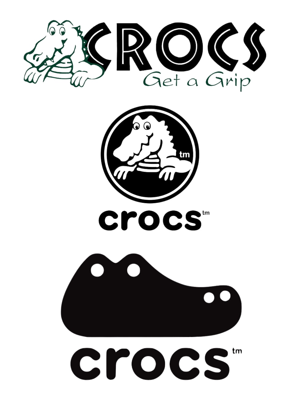
Crocs
With a clever marketing strategy and a fresh logo in 2019, the company has consistently improved its revenue. In 2020, it was around 1.38 billion US dollars, and in 2023, it jumped to 3.96 billion dollars.
Tired design
If your logo is more tired than trendy, it may be time for a redesign. It doesn’t need to be a complete overhaul because a few small changes can have an impact.
Let’s look at the top sporting brand Adidas. The redesigned version takes inspiration from the original, with the same font, black and white color scheme, and the signature three lines.
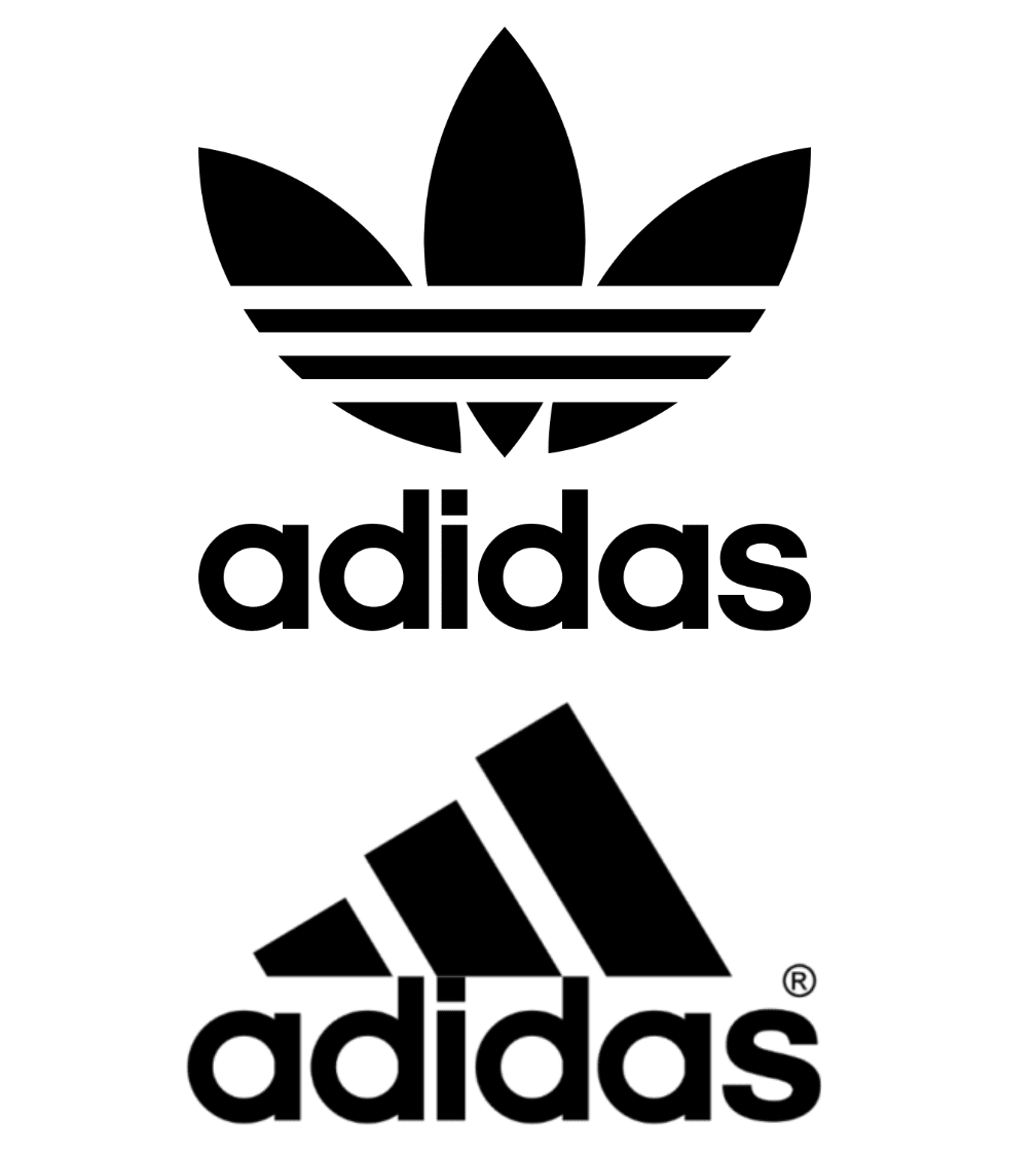
Adidas
But, it’s more versatile with its sleek, straight edges. It still shouts “retro and iconic” but with a modern mountain-climbing twist.
Find logo design services on Fiverr
What to consider when redesigning a logo
A logo redesign isn’t something you should do on a whim. If you get it right, it’ll improve your brand image and connect you with more customers. But, without careful planning, you may end up with a logo that has the reverse effect.
So before you start mixing up colors and fonts, take some time to consider the following:
Business objectives
You should already know why you need a new logo, and the design should align with your business goals.
Let’s say you want to expand your company across borders. Your logo will need to be culturally appropriate and appeal to both your existing customer base and the new audience.
You also need to think about how and where it will be used. For example, you will want your logo to be ready for anything — from a business card to a website to your social media profiles. The colors and fonts you choose should look good both in-person and online.
Your logo should appeal to your target demographic. Consider seeking customer feedback on potential designs to make sure you get it right. Try sharing your top three designs on social media and asking your followers to vote for their favorite.
Psychology of shapes
Shapes are more than pretty pictures. They are part of your visual identity and can be the key to making your logo stand out.
Before settling on a shape, think about the message you want to get across. Let’s look at some different options side by side:
Circle: A circle has no beginning and no end. If you want to show your target audience that your brand is consistent, wholesome, and reliable, consider this shape.
Popular brands with circular logos: Starbucks, NASA, BMW, and Pinterest.

Square: Because a square has straight edges, it doesn't have the softness that comes with a circle. In a logo, a square says the brand is professional, strong, and credible.
Popular brands with square logos: GAP, Lego, Microsoft, and Adobe.
Triangle: Triangles are modern and signal a forward-thinking brand. Triangles can be both adventurous and creative.
Brands with triangular logos: Adidas, Airbnb, Mitsubishi, and Reebok.
Abstract: A customized logo with an original shape can make a business more memorable. They can have straight or curved lines — or a mixture of both.
Brands with abstract logos: Squarespace, Nike, Puma, and McDonalds.
TIP: You can be literal with your shapes so your customers know exactly what to expect. This can work well if your brand name is non-descriptive. For example, a hairdresser with the name “Jenny’s House” may include a pair of scissors in the logo. Or, a gardener may have an abstract tree.
Color theory
Colors can affect our mood and influence how people feel about a brand. Here are what different colors can say about your company:
Red: is passionate, powerful, and confident. Use it sparingly because this strong color can also symbolize anger or danger.
Brands with red logos: Coca-Cola, Kellogg’s, Canon, Marvel, Netflix, and Target.
Orange: is a playful hue that can make you feel optimistic, creative, and energetic. It’s peaceful and suited to natural, eco-friendly brands. It is calm and harmonious.
Brands with orange logos: Fanta, Mastercard, Nickelodeon, Reese’s, Home Depot
Yellow: is a warm color that says happiness, creativity, and energy. While sunny and upbeat, it is a strong hue, so use it sparingly.
Brands with yellow logos: McDonalds, Chupa Chups, Shell, Post-It, and CAT
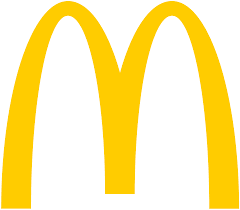
McDonalds
Blue: is a tranquil color that’s trustworthy and professional. Blue also says the brand is reliable and authoritative. Nearly 40% of Fortune 500 companies use a shade of blue.
Brands with blue logos: Ford, PayPal, HP, American Express, Philips, Oral B, and Facebook.
Purple: is known as a royal and luxurious color. It’s a creative option that is often used by brands that market to women.
Brands with purple logos: Cadbury, Hallmark, Yahoo!, Taco Bell, and FedEx
Black and white: are a sophisticated, simple, and modern duo. This shows authority, strength, and seriousness.
Brands with black and white logos: Uber, BBC, Gucci, Adidas, WWF, and ABC.
TIP: If you are redesigning your logo and already have an online following, consider using the same color palette. For example, Coca-Cola always combines red, white, and black. Even when the logo design is updated, the colors remain the same.
Your pre-design checklist
Use this checklist to make sure you don’t miss any vital logo redesign steps:
Understand the reasons for the redesign
Research your target audience to understand what appeals to them
Think about the strengths of your current logo
Decide what needs to be changed and what can stay the same
Create a mood board and experiment with color palettes
Consider the psychology of shapes and current design trends
Consult with a graphic designer to get a clear design brief
Ivan is a brand identity expert and graphic designer on Fiverr. He says,
“Before redesigning the logo, you need to understand the character of the company. You can use this information to present the logo in colors that match the business and personify the corporate identity.”

Fiverr, Ivandim
Finally, you need to decide how you will approach the logo redesign. Why not try Fiverr’s free logo maker or hire an expert via the Fiverr marketplace?
Find a logo designer for hire
Logo redesign examples
A long list of well-known brands have changed their company logo. Here are three examples to inspire your next design:
1. Apple
Tech giant Apple launched its first logo in 1976. It was in grayscale with a picture of Isaac Newton with an apple falling on his head.
But, this only lasted until 1977, when the logo was revamped, giving us the bitten apple we know today.
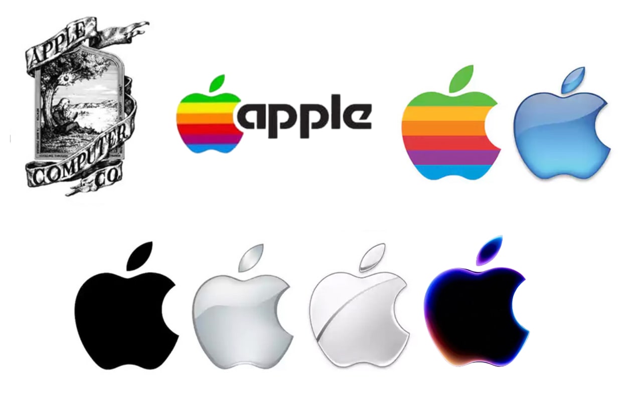
Apple
Despite keeping this shape since the late ‘70s, the apple symbol has had multiple color changes. From rainbow to blue, to black, to silver — these small tweaks are how the tech brand keeps itself fresh and relevant.
2. Starbucks
Coffee company Starbucks has gone through multiple logo changes since 1971. But, despite the updates, the brand’s “Siren” has always been front and center.
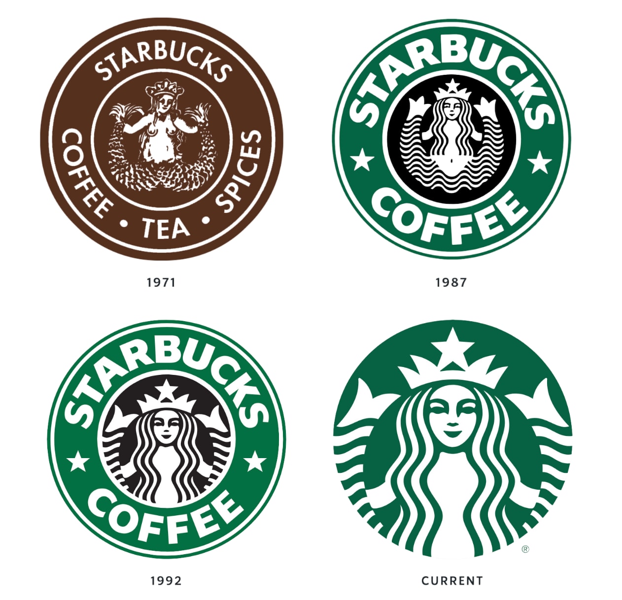
Starbucks
As the muse, the “Siren” has had very few modifications since 1987. She is so well-known and there is such a strong brand identity that the company name is missing from the latest logo refresh.
Starbucks
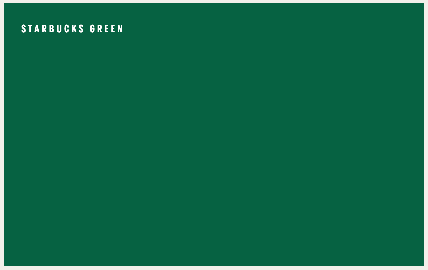
It’s not just the symbol that is easy to recognize. The “Starbucks green” color palette is used consistently in both digital design and in-store. Think aprons, coffee cups, and merchandise.
3. Pringles
Pringles are stackable chips with the taglines “Once you pop, you can't stop” and “Once you pop, the fun don't stop.”
The brand also has a unique mascot in Mr P, who is known as Julius Pringles. We met him in 1967, paired with the black and yellow “Pringles” brand name.
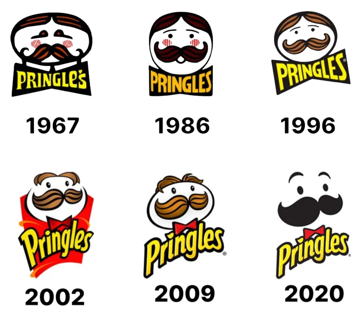
Pringles
Mr Pringles has a curled mustache and a round face. Every few years, he gets a mini makeover, ensuring the design never gets old.
The latest release in 2020 saw a simpler, cleaner logo.While the font colors remain the same, he’s lost his hair and facial outline, but has regained eyebrows and a darker moustache.
How to easily redesign your logo
Logo rebranding is a big move, but it doesn’t have to be a headache. While there are a range of DIY options available, we recommend hiring a professional.
Someone with graphic design experience will understand the importance of colors, shapes, and typography and the type of brand messages they send.
The right person will customize the design to match your brand's personality and give you something that appeals to your target market.
Where do you find a logo designer? At Fiverr, of course. With designers from across the globe offering services at different price points, it’s easy to find the best person for the job. You can also view their portfolio, read reviews, and chat online before committing.
Ready to start? Browse graphic designers in the Fiverr marketplace. Or, if you want to bring your brand’s story to life — try an animator or sonic branding expert.
Logo redesign FAQs
1. How to recreate an existing logo?
If you have design skills and want to tweak your logo, this may be something you can do yourself. However, it’s important to have something professional and versatile.
Make sure you research your audience and consider your products and services before you start. Alternatively, you can hire a designer from Fiverr with the expertise and skills required for a successful logo.
2. Can you modify an existing logo?
You don’t need to start from scratch because a redesigned logo can bring your brand into the future.
Whether changing the color or simplifying the design, a few tweaks can make a big difference.
3. How much does it cost to revamp a logo?
The price to revamp a logo depends on the intricacy of the project and the rates the graphic designer charges.
If you work with a Fiverr freelancer, the price can range anywhere from $5 to $120 or more. For external designers, it can cost hundreds or thousands of dollars.
4. Can I change my brand logo?
Your audience will know your current logo and associate it with your brand. However, if you want to change your design, you still can — as long as you do it for the right reasons.
Related Guides

I have over 8 years of experience writing quality, SEO friendly content. I live in a beautiful regional town in Australia with my husband and three children. I can write confidently in both Australian and US styles and can give you the tone of voice that best suits your brand. Working in a digital agency has given me the opportunity to grow my skills and I can write about almost anything! Don't believe me? Give me a challenge! I look forward to working with you. Anna
