The Role and Importance of Typography in Web Design: Expert Insights
Typography is key to web design, influencing readability, navigation, and brand identity. Choosing fonts that balance clarity, emotion, and performance creates compelling websites.
 January 21, 2025
 5 minute reading
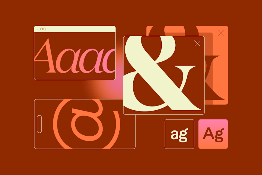
Typography is more than an aesthetic choice. It’s a fundamental element of web design that shapes user experience, brand perception, and overall site functionality.
From its origins in print to its dynamic role in digital interfaces, typography has evolved to balance beauty and usability. Modern web design uses typography to convey emotion, guide navigation, and maintain readability across devices.
To better understand the importance of typography in web design, we’ve consulted Fiverr experts who share their insights on optimizing typography and font usage and avoiding common pitfalls.
💡TL;DR
Do’s
Prioritize readability across all devices
Align fonts with the brand’s tone and identity
Pair fonts thoughtfully for balance and impact
Optimize fonts for web performance
Choose fonts that evoke the right mood
Balance uniqueness with usability
Don'ts
Avoid overly stylized or complex fonts
Don’t use too many fonts in one design
Neglect font hierarchy in size and weight
Overlook mobile responsiveness
Use decorative fonts for large bodies of text
Ignore audience context or demographics
1. Prioritize readability across all devices
Readability refers to how easily text can be read and understood. It involves factors like font choice, size, spacing, contrast, and layout, all of which work together to create a comfortable reading experience for users across different devices and screen sizes.
As Zain A., a website developer, puts it:

“Typography affects readability, visual hierarchy, and brand identity. Choosing fonts that are legible on all devices ensures text is clear and engaging.”
Connect with FreelancerReadable typography improves user retention and makes your website approachable. Combining clean sans-serif fonts for body text with more stylized headers balances readability and visual appeal.
2. Align fonts with your brand identity
The fonts you choose for your logo design and website text are a visual extension of your brand style. Each font communicates a distinct message. For example, serif fonts exude elegance and tradition, while sans-serif fonts offer a modern and sleek look.
Casios3dstudio, an architectural visualization specialist, shares:
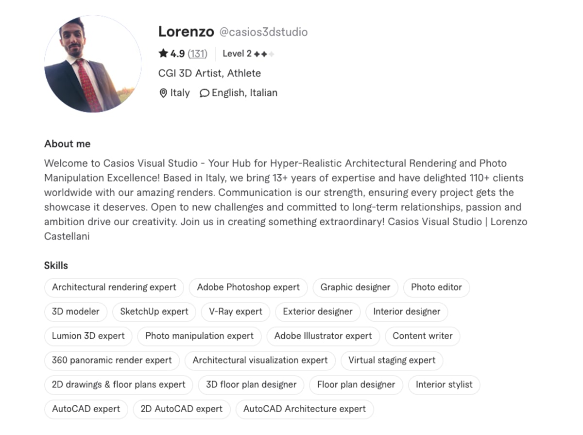
“The right font choices can make a design feel professional, approachable, or even playful, depending on the context.”
Connect with FreelancerWhen selecting fonts, consider the emotions and values you want your brand to convey. A tech startup might benefit from minimalistic sans-serif fonts, while a luxury retailer could opt for sophisticated serif fonts to reflect exclusivity.
3. Create a visual hierarchy with typography
Effective typography in web design requires a clear visual hierarchy. By varying font sizes, weights, and styles, you can direct users’ attention to the most important elements of your site, such as headlines, subheadings, and CTAs.
Michael C., a website developer, emphasizes:

“Good typography helps grab attention and guide users through the site smoothly. Pairing a strong header font with a readable body font creates balance”.
Connect with FreelancerA well-structured hierarchy makes your content easier to scan and improves usability so that users can find what they’re looking for quickly.
4. Limit the number of fonts
It is possible to have too much of a good thing. Using too many fonts clutters your design and confuses users. Limiting your font choices maintains consistency and professionalism while providing enough variety to create interest.
Logo_Affairs, a graphic designer, advises:
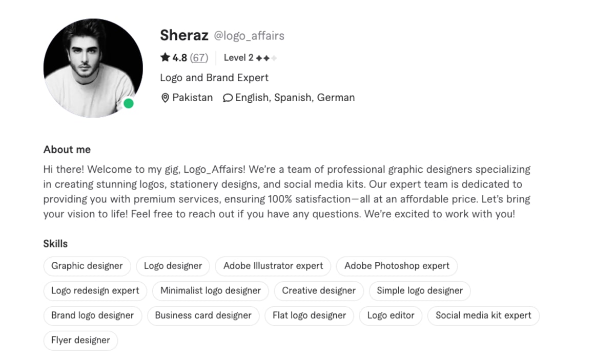
“I use a limited number of fonts to maintain a cohesive look, typically pairing a serif and sans-serif for variety without overwhelming the design.”
Connect with FreelancerA unified font palette improves your site’s aesthetic appeal. It also keeps the text aligned with the overall design language.
5. Test font compatibility across platforms
Not all fonts render equally well across devices and browsers. So, it’s essential to test font compatibility before deciding which font you’ll use.
Valentin, a UI and UX designer, explains:

“Proper font selection and layout help minimize user strain and ensure clarity across various devices and resolutions.”
Connect with FreelancerUsing web-safe fonts or reliable platforms like Google Fonts helps maintain consistency and compatibility.
6. Balance typography and website performance
Large, custom font files can slow down your site’s loading speed, affecting user experience and SEO performance. Optimizing font files by compressing them and limiting the number of font weights and styles helps minimize this impact.
Zain A. highlights:
“I consider compatibility and web performance to avoid rendering issues and optimize loading times.”
Connect with FreelancerBalancing typography with performance keeps your site functional and visually appealing without compromising speed.
Elevate web design through typography
Typography in web design is a powerful tool that goes beyond aesthetics. It influences readability, guides user navigation, reinforces brand identity, and affects SEO.
By prioritizing legibility, aligning fonts with your brand’s personality, and maintaining a clear visual hierarchy, you can create a functional and visually compelling website.
Related Guides

Fiverr is a leading digital freelance solution on a global scale, providing you with access to high-quality, specialized, and diverse human talent on an AI-enhanced platform. We pride ourselves on being the best place to get the most value for your budget—whether you’re part of a startup or Fortune 500, whether you need help on a simple task or complex project.
