The Best 12 Data Visualization Tools to Try in 2025
Find the perfect data visualization tool to bring your business data to life.
 February 2, 2025
 13 minute reading
We live in a world immersed in data. It’s easier than ever before to collect data to improve your business processes. And understanding that data is essential for making correct business decisions.
Unfortunately, massive quantities of data are challenging to understand—without some extra help. That’s where data visualization services and tools come in.
Using data visualization tools makes data analysis relatively easy. These tools let you create dashboards with bar charts, pie charts, scatter plots, and other visualization reports to improve business intelligence and help you analyze massive amounts of data.
This guide covers the 12 most useful data visualization tools for improving data-driven decision-making.
Best data visualization tools for 2025
We’ve included various tools below so that we cover the full spectrum of use cases. Some tools are suited for beginners while others are better for experienced data scientists. We’ve also included both free data visualization tools and enterprise tools.
All the visualization software we recommend offers self-service functionality. However, if you’d like to get help from a pro, you can also get data dashboard services from Fiverr experts to help you.
1. Tableau
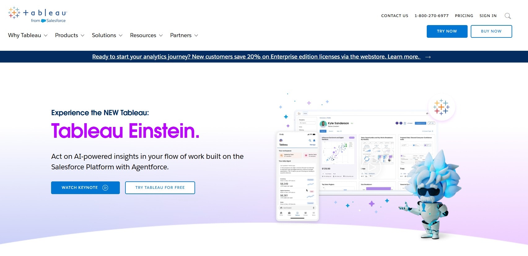
Tableau
Tableau—which is owned by Salesforce—is one of the most well-known data visualization platforms around. It offers a web-based and desktop version. The company’s free version of the tool is called Tableau Public. Unlike the paid version, Tableau Public visualizations are all publicly viewable and can be downloaded by others.
You’re allowed to use Tableau Public for commercial projects. However, you can only use its free desktop version for non-commercial projects.
Tableau recently added Tableau Einstein, which brings chat-based AI to the data visualization platform. Using Tableau Einstein, you can query your underlying data using prompts and see responses in visual form.
Tableau is a well-established data visualization tool supporting hundreds of data sources and formats. The learning curve is steep but plenty of tutorials exist to help you create anything from social media heat maps to SQL-based interactive charts.
2. Power BI
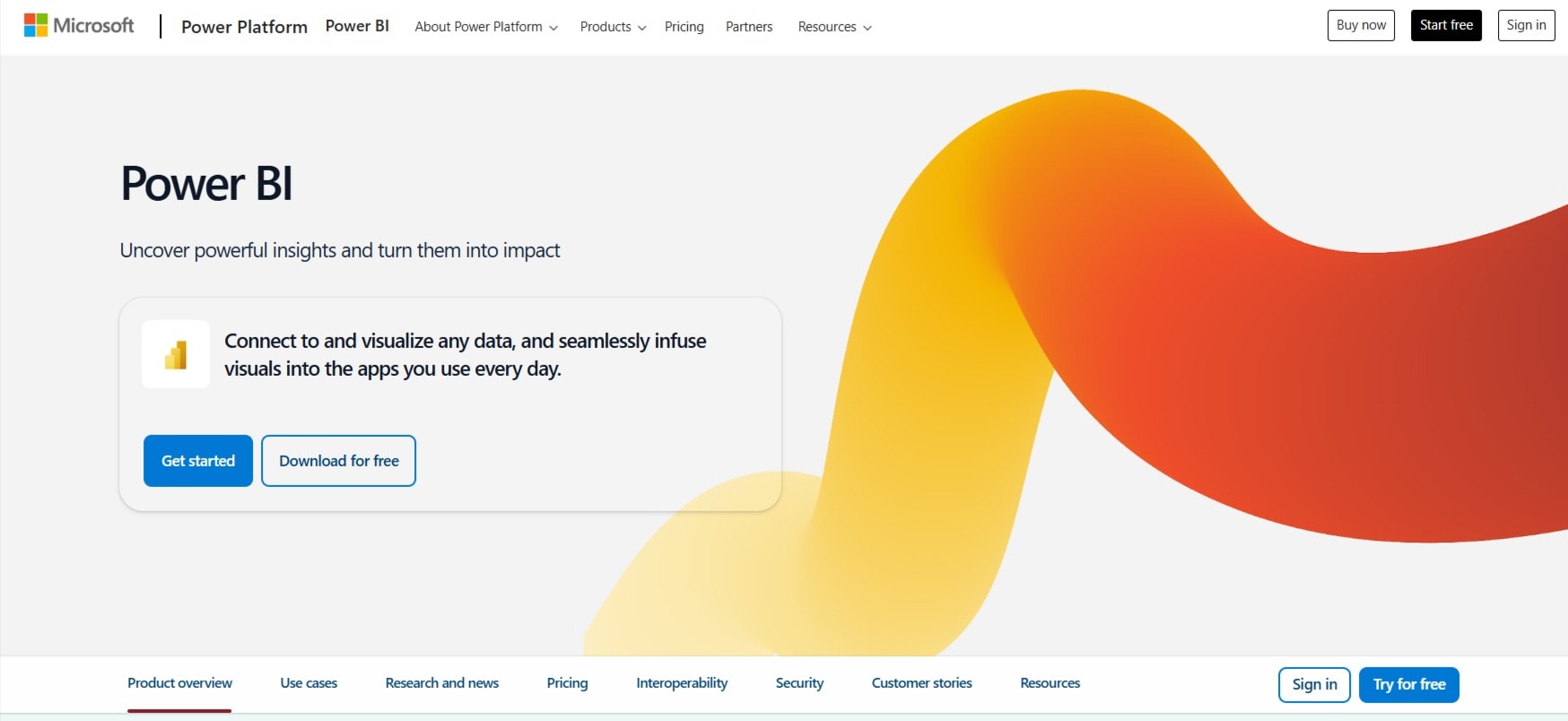
Microsoft
Microsoft Power BI (Business Intelligence) is a user-friendly data visualization tool that integrates with Microsoft products. In addition to the expected data connections, such as Excel spreadsheets, CSV files, and SQL Server, Power BI also lets you connect to Oracle, MySQL, and IBM databases. In total, the tool supports hundreds of data sources.
Power BI has a web and desktop version. They have a free tier that lets you create visualizations, but you can’t share them with others.
Despite the tool’s ease of use, getting started is cumbersome. You can’t sign up with a personal email address and must use a business email that’s registered with Microsoft.
If you’re already thoroughly inside the Microsoft ecosystem, using Power BI to simplify your complex data makes sense. However, users outside that ecosystem might find another analytics platform more user-friendly.
3. Qlik
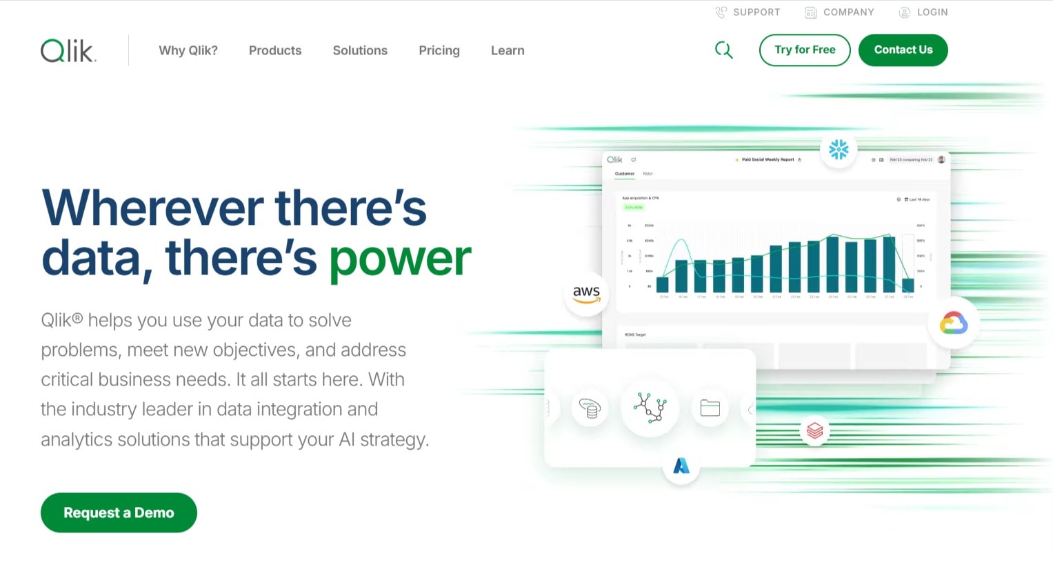
Qlik
Qlik has been in the data visualization game since 1994 when it released its first visualization tool called QuikView, later renamed to QlikView.
Its latest product is called QlikSense, and it allows users to combine underlying data sources for more advanced data analytics on large datasets. QlikSense runs on the cloud while QlikView runs locally.
Qlik is very much an enterprise-level product, with pricing that’s beyond the reach of many small businesses.
Find an Expert Data Visualization for Hire
4. Domo
Domo
Domo is a business intelligence and data analytics company that provides other data services in addition to visualizations. The service is cloud-based and offers 1,000+ data connectors to any type of data.
You can also use Domo to create no-code data apps, or pro-level apps using code.
The tool is aimed at enterprises, with no free tier. You have to talk to their sales team to get pricing.
If you’re using Domo and would like to develop a pro-level app using Domo’s framework, you can buy app development services from Fiverr experts to help you.
5. ThoughtSpot
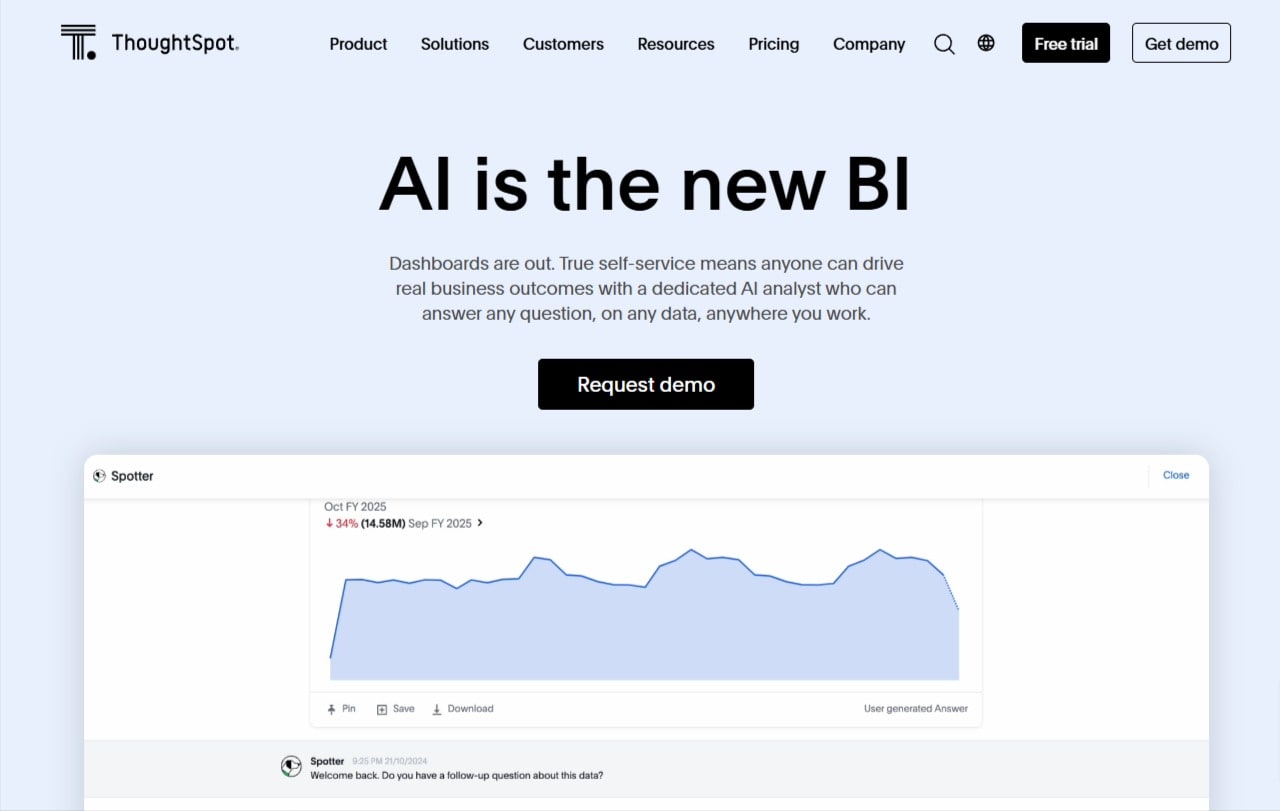
ThoughtSpot
ThoughtSpot is another enterprise data visualization and analytics tool, with pricing starting at $1,250 per month for the most basic package. The tool is intuitively designed, and it immediately presents you with a few interactive data visualizations after you sign up. Finding where to connect data is easy, and the overall onboarding process felt smoother than many of the other tools.
ThoughtSpot
The tool also offers data governance connections, which are essential for enterprise users.
You can sign up for a free 14-day trial.
6. Plotly
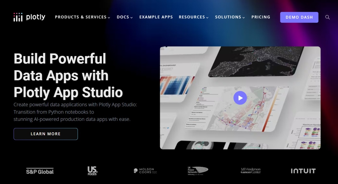
Plotly
Plotly offers data analytics and visualization solutions, especially for developers. Their website says you can use it to transition from using static data science notebooks to more interactive, branded visualizations.
Data Science Notebooks are interactive interfaces where data analysts can create machine learning models, visualizations, and other data-related elements. Data scientists typically use Python to work in data science notebooks. These notebooks are powerful tools but lack the polished look required to share insights and visualizations with others.
Find a Machine Learning (ML) Expert for Hire
The company also offers numerous developer-related services for integrating data visualization and analysis into a development pipeline.
No pricing exists on their website and it’s impossible to create an account without contacting them first.
7. Highcharts
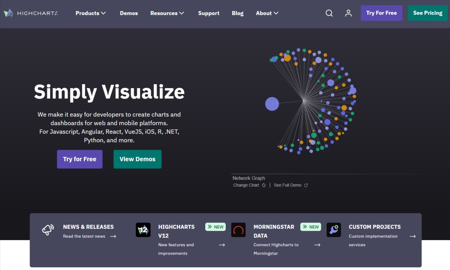
Highcharts
Highcharts is a developer-focused data visualization tool. The platform provides a JavaScript library for generating data visualizations in your mobile app, desktop app, or web application.
Unlike other tools on this list, you can’t create visualization directly using Highchart. Instead, you must integrate it into a platform or app that you're building.
Various official integrations for different frameworks exist, such as Vue, NodeJS, Angular, and React. The company has even ported the JavaScript library to Python, allowing non-JavaScript developers to leverage the charting APIs.
Unofficial libraries also exist for Java, PHP, iOS, and other programming languages and platforms.
8. RAWGraphs
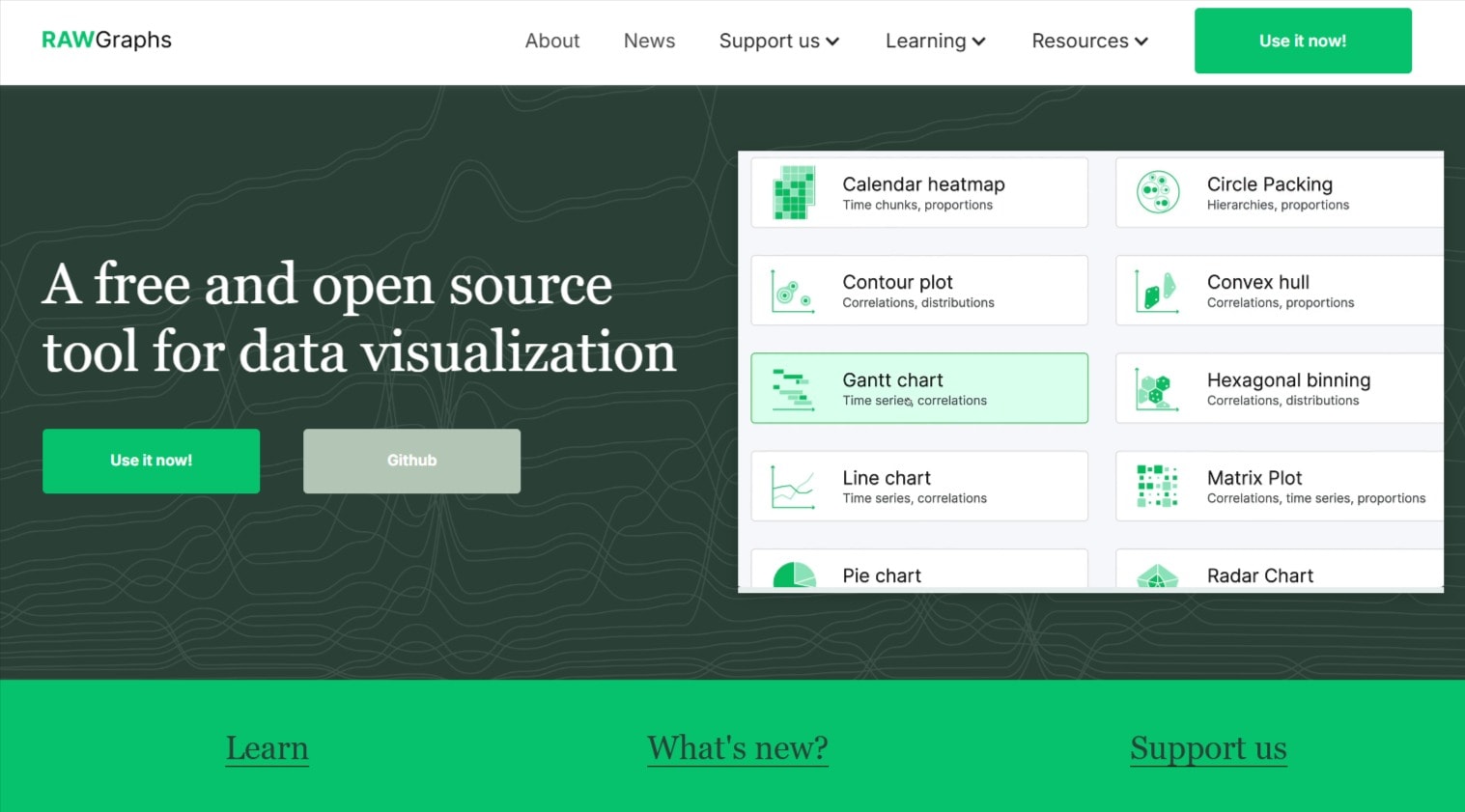
RAWGraphs
RAWGraphs is an open-source tool that lets you create respectable visualizations for everyday use. The tool doesn’t connect to data sources directly so you can’t get real-time interactive dashboards.
To create a visualization, you must paste the data directly into the tool or provide a web address with one of the types of data it supports—which are extremely limited.
However, the no-frills tool has its benefits. The learning curve is minimal, making it easy to grasp the drag-and-drop interface. You can select from dozens of visualization types and use those static visualizations commercially with no attribution.
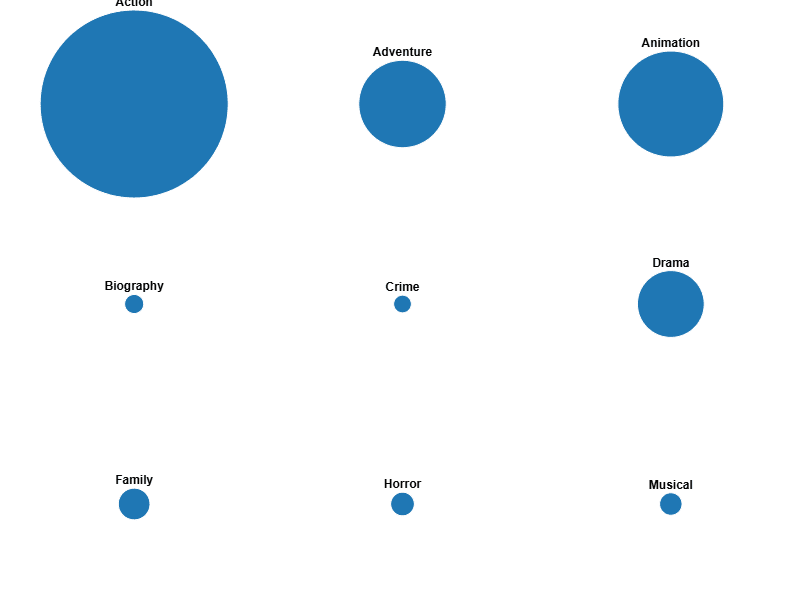
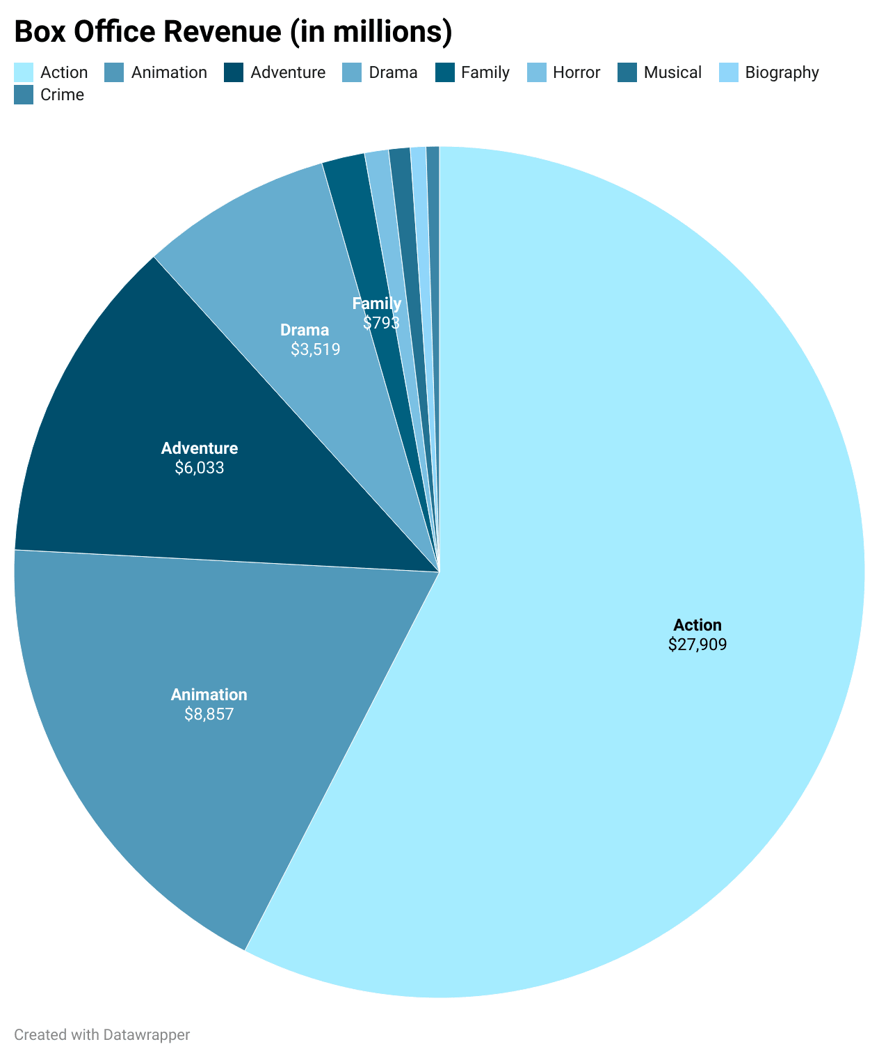
You’ll likely need to modify the underlying data yourself to get the visualization you need, which makes the tool somewhat unintuitive. For example, we pasted data about the highest-grossing movie genres and asked RAWGraphs to give us a pie chart. Instead, it gave us multiple pies, one for each genre.
RAWGraphs
If you need help modifying your data so RAWGraphs understands it better, you can buy data services from Fiverr experts to help you.
9. Datawrapper
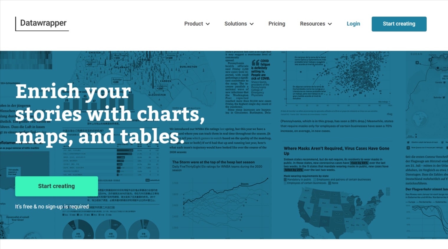
Datawrapper
Datawrapper is a powerful tool that lets you create many free visualizations—with attribution. If you’d like to remove the attribution, the tool costs $599 per month.
Datawrapper is used by The New York Times, The Los Angeles Times, UNESCO, and other well-known brands. The tool’s visualizations are high-quality and professional.
Unfortunately, Datawrapper supports very few data connectors, and it doesn’t support SQL connections. If you’d like to connect to an online source, the data must be formatted as a CSV or JSON file.
However, the tool is an excellent option for anyone looking for a free—yet sophisticated data visualization tool. We tested the same movie data as above and Datawrapper understood the data correctly. Datawrapper also provides far more customization options than RAWGraphs.
Datawrapper
10. Sisense
Sisense
Sisense is an enterprise data solutions provider that allows companies to easily analyze big data. It has an analytics suite that uses AI and machine learning to find insights in big data.
Sisense’s primary differentiator is that it lets you combine different types of complex data easily while also providing user-friendly visualization features. The combined data doesn’t need to be modified or changed by the IT department to make it usable, even when dealing with billions of rows.
Similar to other enterprise-level providers, it offers no pricing details on its website. You have to contact sales to know what it would cost.
The company offers multiple data solutions, including cloud, embeddable, programmable components, and a data modeling solution to easily combine data sources.
11. D3.js
D3.js
D3 is a powerful JavaScript library for developers to add highly customizable visualizations to their apps. The tool is standards-based and is used by numerous multinational companies. It’s open-source and free.
The learning curve for D3 is steep, which even the official website admits. However, its flexibility allows experienced developers to create visualizations that would otherwise not be possible using other tools.
If you want to build a custom D3 visualization but don’t know how, you can get web application programming services from Fiverr experts to help you.
12. Zoho Analytics
Zoho Analytics
Despite being last on our list, Zoho Analytics was one of our favorite tools. The platform is easy to use, user-friendly, and comprehensive. It connects to hundreds of data sources and also allows you to blend data from those sources. Zoho Analytics’s workflow feels smooth and intuitive while providing high-quality data visualization and dashboards.
Zoho Analytics has a guided intro tour and also a free version which will suit many businesses for essential use cases. The platform offers tools to modify data and check its quality after uploading, as well as real-time updating.
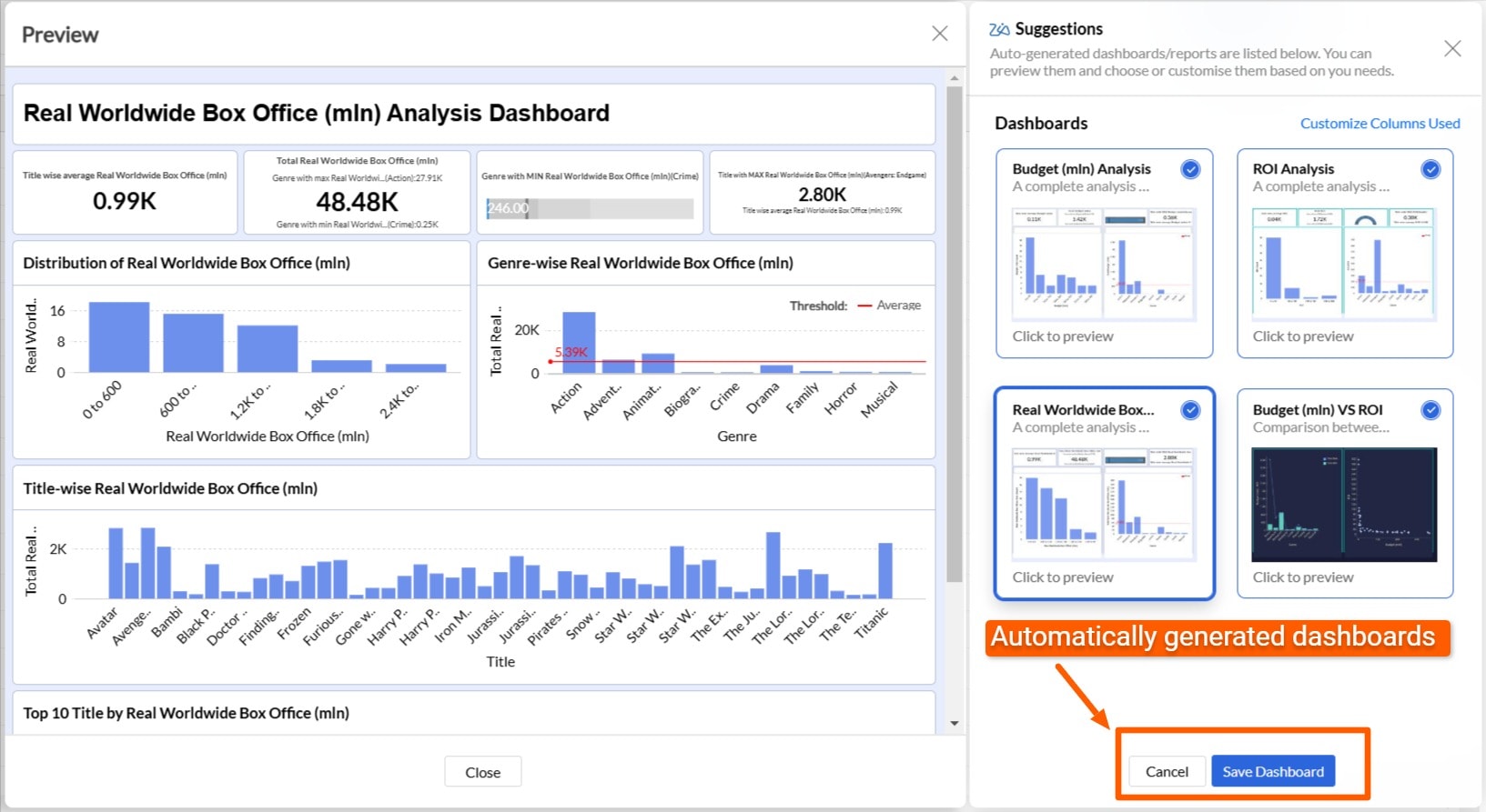
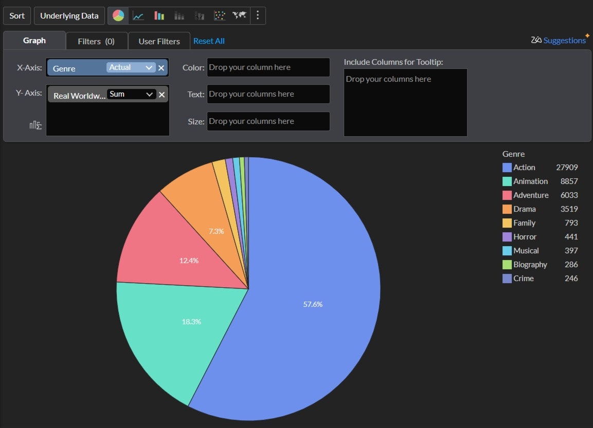
We wanted to test a simple pie chart data visualization for our best-grossing movie data. However, Zoho Analytics went above and beyond, analyzing the data, grouping it, and presenting a full dashboard based on a single upload.
Zoho Analytics
We did go ahead and generated the pie chart, which was intuitive and painless. No need existed to modify the underlying data. Zoho Analytics aggregated all the underlying data for us, and you can change the chart type with a single click.
Zoho Analytics
How to choose data visualization tools
Each tool above has distinct offerings. Depending on your specific use case, some tools provide too many features, while others don’t provide enough.
Developers would need one of the developer-focused tools, while everyday users would likely prefer the more intuitive ones.
Here are some criteria to consider when choosing your data visualization tool:
Technical considerations
Technology is one of the primary factors to consider when choosing a data visualization tool.
For example, if you’re a developer, you’ll need a tool that embeds visualizations in the app you’re developing, such as D3.js or Highchart. If your team uses Office 365 and other Microsoft products extensively, Microsoft Power BI might be the best choice because it integrates so smoothly with Microsoft products. However, if you use Google Workspace, Power BI would be relatively useless.
Real-time versus static data
If you only need a few graphs and charts to create an infographic or to add to a Canva design, static data is totally fine. However, if you’re looking for BI analytics with live data, such as e-commerce sales, real-time updates are a must-have.
Find an Expert Data Analyst for Hire
Visualization capabilities
All the tools above offer the major visualization types for most use cases. However, for extremely specific capabilities, you might consider using a more specialized tool such as D3.js.
“Too much” capability can also be a problem. One of the senior maxims of data visualizations is to maintain a high “data-ink” ratio.
The data-ink ratio refers to how much ink (pixels) is being used for the data itself. The more ink used for surrounding design elements, the less effective data scientists consider that visualization to be. It’s great to create “pretty” visualizations. However, if your purpose is purely data-driven, it might be best to skip the fancy templates and use a tool that focuses on more homogenous designs, such as RAWGraphs.
Output and sharing
If you’re creating data visualizations only for yourself, sharing and exporting them isn’t vital. In that case, the free version of Microsoft Power BI might be a good choice. The free tier offers robust data visualizations—but you can’t export them.
Before deciding on the tool you’ll use, you should also check if it exports the visualization in the format you want, such as PDF, PNG, or JPEG.
Additional capabilities
Several of the tools listed above provide more than data visualization. They also offer predictive analytics and other data science features. Such tools are useful for enterprise customers and data scientists. However, the typical small business might find additional features overkill.
Value for money
The tools we’ve selected range from free to over $1,000 per month, and possibly higher. There’s no point in paying for the most amazing tool if its price-to-value ratio doesn’t match your needs.
Hire a data visualization specialist on Fiverr
Fiverr has data visualization consultants ready to help you with your data visualization projects. Whether you need underlying data sources combined and modified for better visualizations, or need the actual data visualization created, Fiverr experts have skills across the gamut of data visualization needs.
Check out Fiverr’s talent and bring your data visualization project to life.
Data visualization tools FAQs
1. What are the best tools for data visualization?
Many tools exist for data visualization, each with unique offerings. Some tools offer only data visualization, while others also provide other data analytics services. Some tools are free and others cost many thousands of dollars a year. You’ll find the best tool within that range of criteria, based on your specific use case.
2. What are the best AI tools for data visualization?
Tableau Einstein, ThoughtSpot, and Domo have all built chat-based tools driven by AI which derive insights from your underlying data. Other data visualization providers are also integrating AI to varying degrees.
3. Is Tableau a data visualization tool?
Tableau is a popular data visualization tool. It offers a web-based and desktop version, as well as a generous free tier for many small business use cases. More recently, Tableau introduced Tableau Einstein which adds AI capabilities to Tableau’s data analysis tools.
Related Guides


About Author
R. Paulo Delgado Tech & Business Writer
R. Paulo Delgado is a tech and business freelance writer with nearly 17 years of software development experience under his belt, including WordPress programming. He is also a crypto journalist for Moneyweb, and proudly a member of Fiverr's Pro Seller program — hand-vetted professionals, verified by Fiverr for quality and service.
