What Is Data Visualization? Types and Tools (2025)
Data visualization turns complex data into clear visual formats like charts and graphs, making it easier to understand trends and insights. It’s a powerful tool for uncovering patterns and driving informed decisions across industries.
 February 6, 2025
 12 minute reading
The move to digitalization means we have access to more data than ever. In 2023, the world created 120 zettabytes (ZB) of data—about 337,080 petabytes (PB) a day. Facebook alone produced 4 PB a day.
In businesses, we also work with data every day. Businesses gather data from ecommerce stores, social media engagement, web analytics, and dozens of other tools.
How do you make sense of all that data and extract actionable insight to improve your business? The answer is data visualization.
What is data visualization?
Data visualization is the visual representation of data and information through graphs, charts, maps, and other graphical images. It provides an accessible method for viewing and understanding data sets, including trends, outliers, and other helpful patterns.
Data visualization is an essential subcategory of data science and makes it easier to perform data analysis on complex data.
Anyone can use data visualization, and it’s commonly used in the following contexts:
Big Data and large datasets
Business Intelligence (BI)
Financial Reporting
Scientific Research
Social Media Analytics
Any time you log into a service and see a dashboard with graphs and charts, that’s an example of data visualization.
Purpose of data visualization
The purpose of data visualization is to communicate insights about underlying data rapidly.
Data analysts use effective data visualization as a means of presenting data. Using a graphical representation of data makes it possible to quickly convey new insights that wouldn’t be possible without visualization.
Visual elements play a key role in decision-making. A study from the Departments of Psychology at the University of Utah and the University of California states, “We use visual information to inform many important decisions.”
Data visualization is also essential in data storytelling. A report by PwC says, “Human beings have evolved to remember stories more effectively than any other content structure.” The report then describes the irrefutable power of images to communicate those stories.
“Evolutionary theory confirms that over the course of human existence, our visual system has evolved to process multiple images in parallel. Text, which appeared much more recently in human history, must be scanned one character at a time. Those characters must be recognized and pieced together into words, then sentences – all before being processed for meaning,” the report says.
Data scientists use data visualization to bring raw data to life. The visual elements help stakeholders and decision-makers easily perceive correlations between data sources and so make better data-driven decisions.
Types of data visualization
Different types of visualizations are required depending on your use case. The most obvious example is geospatial data, typically visualized on a map. However, a line chart would be better suited for a time series.
Find an Expert Data Visualization for Hire
Let’s look at other data visualization types.
Basic charts and graphs
The most basic data visualization charts in data analytics are:
Line charts
Bar charts/column charts
Pie charts
Scatter plots
Let’s look at each visualization in more detail.
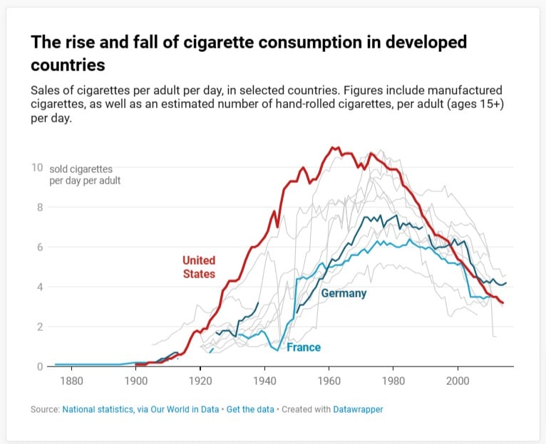
Line charts
Line charts, also known as line graphs, display data points using lines, usually spanning time. They’re useful for revealing trends and rates of change.
Datawrapper
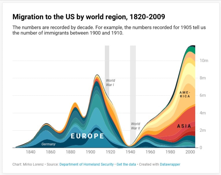
Related to the line chart is the area chart, which is a “filled-in” line chart.
Datawrapper
Bar charts and column charts
The only difference between a bar chart (or bar graph) and a column chart is that a column chart uses vertical columns while a bar chart uses horizontal bars. Both chart types show one value compared to another value.
Datawrapper
A subcategory of the column chart is the histogram.
Histograms represent data by separating it into “buckets” or “bins,” showing how it is distributed. Technically speaking, the histogram shows the distribution of values.
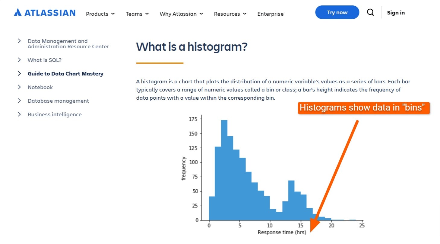
Atlassian
Pie charts
Pie charts help show the parts of a whole. They’re designed in a circle, each part being a “slice” of the pie.
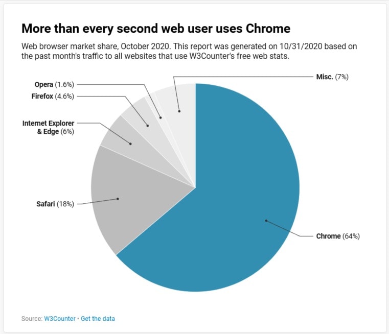
Datawrapper
Scatter plots
Scatter plots help show the correlation between one variable and another. The first correlating variable is plotted against the Y axis, and the second is on the X axis. Scatter plots can also help find data clusters, determine trends, or find outliers.
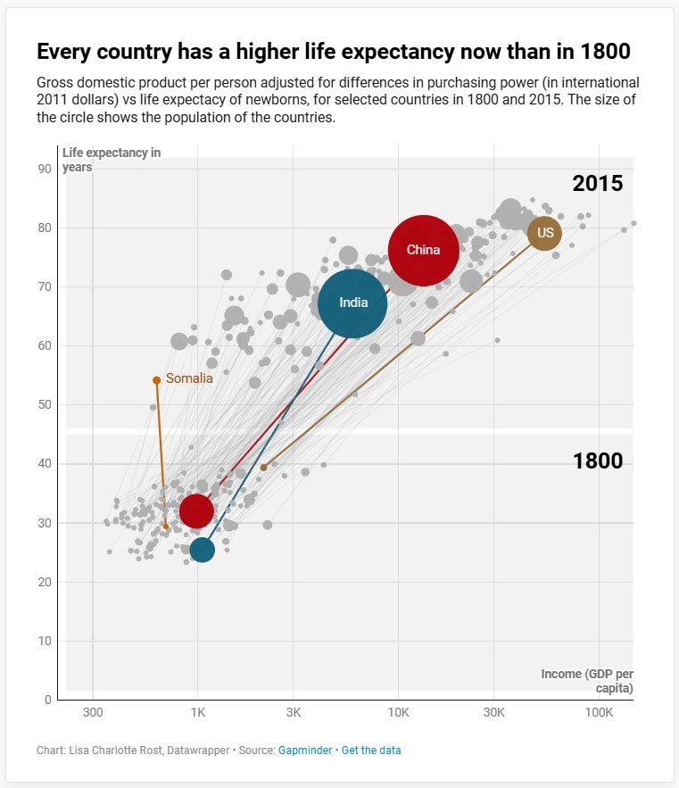
Datawrapper
Find an Expert Data Analyst for Hire
Advanced visualization techniques
Heat maps
Heat maps visualize data through color intensity. The higher the value, the more intense the color.
Heat maps can take many shapes and forms, such as data in a table or on a geographical map.
A “choropleth” map is a specialized type of geographical heat map that shows color intensity regardless of geographical borders. An “isopleth” map is a geographical heat map that considers physical borders.
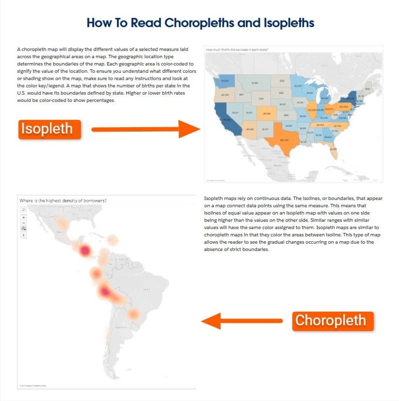
Tableau
Treemaps
A tree map displays hierarchical data as nested rectangles. The size of each rectangle is proportional to the value it represents. A treemap helps compare proportions in hierarchical data, which is why it’s called a “tree” map.
Although pie charts also represent part-to-whole relationships, they can be more challenging for humans to recognize differences in portions than in a treemap.
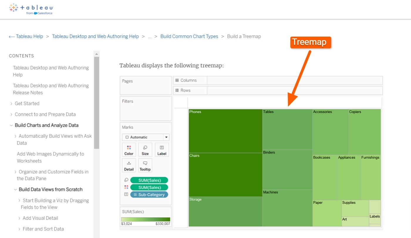
Tableau
Bubble charts
A bubble chart is a scatter plot with a third variable added. The bubbles represent two variables—the X and the Y values on a graph, and the bubble size represents the third variable.
A bubble chart can even show a fourth variable, as displayed in the chart from the Google Charts help pages below. The chart shows:
Y-axis: Fertility rate
X-axis: Life expectancy
Bubble size: Population
Color: Region
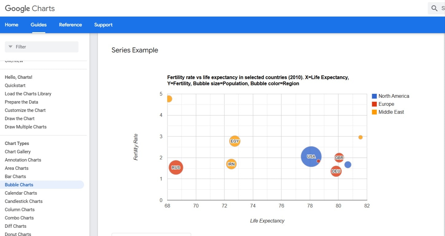
Google Charts
Sankey diagrams
A Sankey diagram visualizes the quantity and direction of flows. People use Sankey diagrams to visualize transfers of resources and changes in state between different stages. The width of the flow represents the quantity.
The diagram takes its name from Captain Sankey, who created the first Sankey diagram: A visualization showing steam engine efficiency using arrows with different widths, each proportional to the quantity of heat loss.
Sankey diagrams can be created with differing levels of complexity, such as the multilevel Sankey diagram shown below.
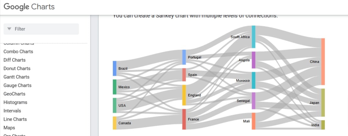
Google Charts
Interactive visualizations
As technology has advanced, data visualizations have become increasingly more interactive. Instead of a static chart, visualizations often contain animations or tooltips when you hover over them.
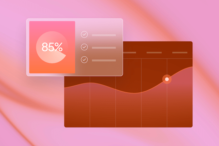
Dashboards
A dashboard is a collection of data visualizations arranged on a single page. Dashboards provide a quick overview of the most critical metrics and can often be customized by end-users.
Dashboards have become an increasingly common feature of online services that do anything with data.
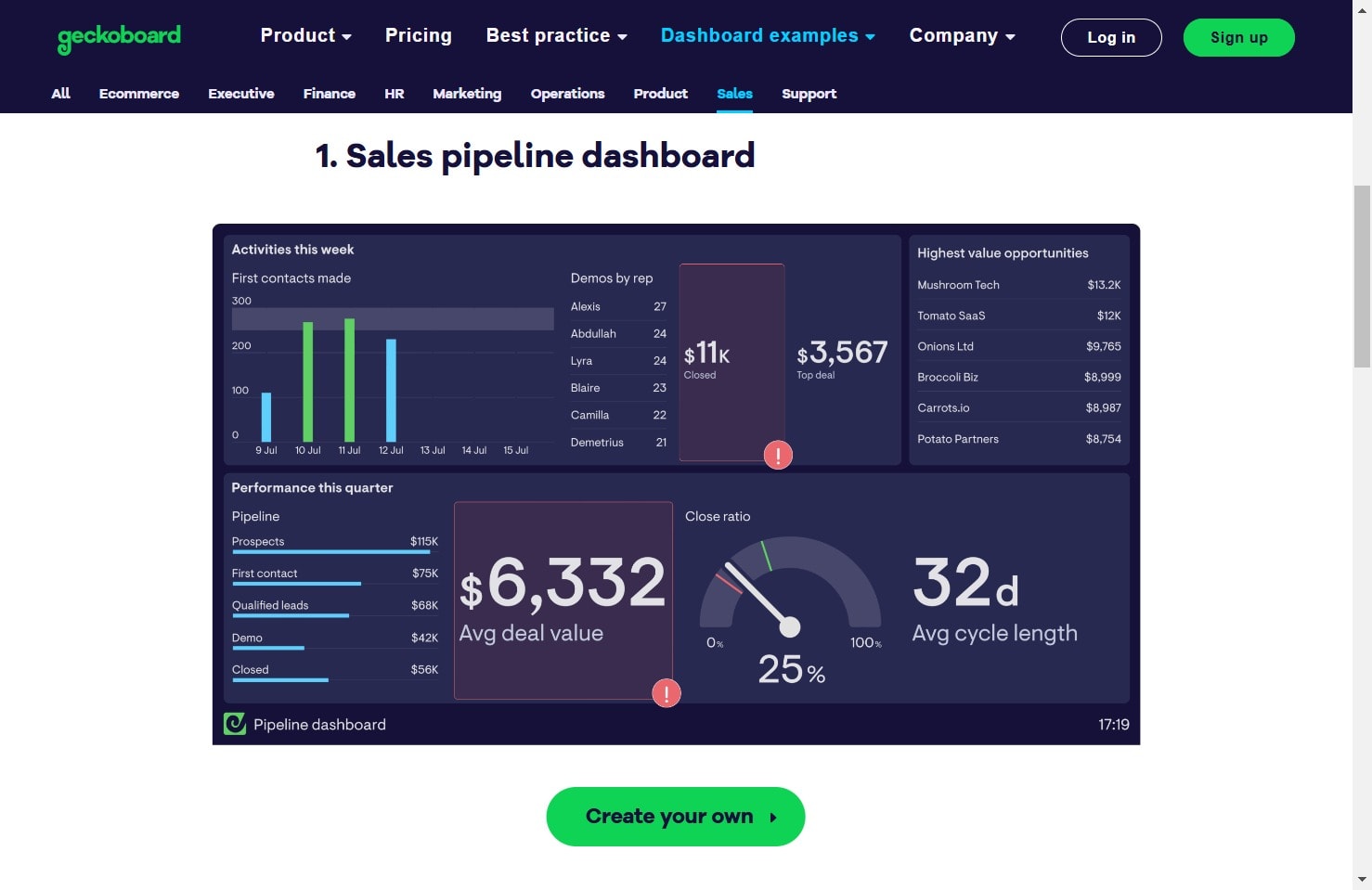
geckoboard
Drill-down charts
“Drill down” in a data context means looking deeper into a data set to understand what makes that data up. For example, imagine the following financial data:
Sales: $150,000
Marketing: $50,000
Salaries: $50,000
If we “drill down” into the sales figure, we might see something like the following:
Product A: $20,000
Product B: $30,000
Product C: $100,000
We can further drill down and see details such as:
Sales by geographic region
Sales by product and geographic region
Sales by demographic
Etc.
It would be impossible to easily show all the drilled-down data on a single dashboard, which is why an interactive drill-down feature is so useful. The user simply has to click a metric and is then guided to a more detailed version of that metric, showing all the drilled-down data.
Interactive maps
An interactive map is another form of drilling down, specifically for geographic data. Instead of clicking on a chart for more detailed data, you click on a geographic location.
For example, the following map from an email marketing dashboard shows how many people clicked an email by location. Clicking on the location then drills down into more detailed data, showing you the clicks from each city.
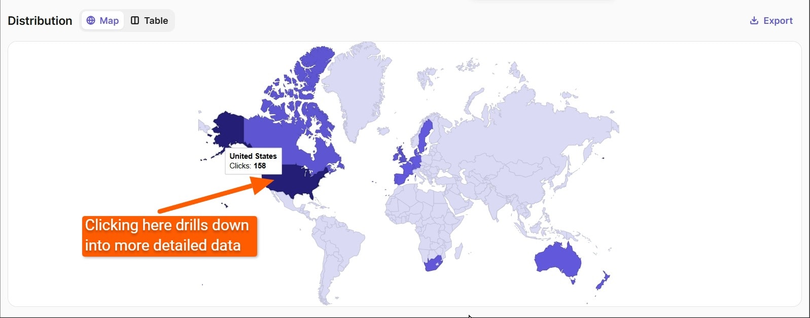
Brevo
Filter and sort features
When dealing with tabular data, adding sorting and filter features lets you look at only the data you’re interested in. Filters and sorts make it easier to find the important data for your current analysis.
Real-time data visualization
Any of the above data visualizations can be updated in real time, allowing stakeholders to monitor key metrics as they happen. Real-time dashboards can contain live-streaming charts or even dynamic infographics.
The options for creating data visualizations are limited only by someone’s knowledge of data and the different types of visualizations. Don’t worry if you don’t know which chart type to use to represent which data. You can always get a Fiverr data visualization charts expert to help you.
Data visualization tools
There are various data visualization tools that can help you create whjat you need.
If you’d like a customized data visualization, you’ll likely need basic programming using Microsoft Excel, open-source libraries, or Python code. (If you lack programming skills and need help using these tools, you can get help from a professional on Fiverr.)
If you’d prefer a DIY approach, you can check out the following tools:
Google Looker Studio: Free, web-based data visualization tool with 1,060+ data connectors. It provides a template gallery but uses templates sparingly to avoid violating the “data-to-ink” ratio for good visualizations.
Tableau: Popular enterprise-focused data visualization tool with both cloud and desktop versions. It offers tutorials and templates but is more expensive for enterprise users.
Datawrapper: Free tier for unlimited visualizations. Used by institutions like Harvard and UNESCO. Paid options and an enterprise version are also available.
D3.js: Open-source JavaScript library for custom data visualizations. Used by companies like EY and Accenture. It is ideal for unique visualizations but requires technical expertise due to its complexity.
Data visualization best practices
Effective data visualization requires more than opening up an app and slapping a few metrics on a chart. Several best practices exist, ranging from the underlying data to design principles, to ensure your data visualization has the best chance of telling the correct data story.
If you need help working out compelling data visualizations, Fiverr has data visualization experts who can help you. If you’d like to try creating data visualizations, here are some of the most important best practices.
Make sure the data is correct
Before creating a data visualization, you must check that the data is correct.
Defining “correct” data depends on your needs, and you might need to hire a data science expert to help you figure out what that means. Data can tell different stories depending on how it’s presented. All of these stories might be “correct,” depending on what you’re analyzing.
Making sure data is in the correct format is especially important in machine learning because it deals with enormous data sets and draws correlations that humans don’t immediately recognize. If you take those correlations and restructure them into more meaningful segments, you can then create data visualizations that help stakeholders understand the story behind the numbers.
Basic design principles
Whether you’re creating an interactive data visualization or a static one, you must follow basic design principles.
The purpose of design principles is to ensure your design communicates its intended message. Some of the most important design principles are:
Center of focus: Different design techniques exist to draw attention to one or more elements in a design, such as color choice and size of the central element.
Shape choices: Using different shapes for different data points might help visually show their differences. However, using similar shapes is essential to make a design more aesthetically pleasing. When designing your data visualization, you must thoroughly understand shape theory to choose which way to go.
Color theory: Color theory includes using colors that fit together, such as complementary colors, or using colors based on the emotions they elicit. Color depth is also essential so you can create a visualization that’s pleasing to the eye.
Accessibility considerations: Your data visualization should be accessible. Some things to consider for accessibility include contrast so that users can navigate through interactive elements using their keyboards, and that text size can be increased so all users can see it.
Data-to-ink ratio:
American statistician and professor Edward Tufte introduced the concept of data-to-ink ratio in his 1983 book, “The Visual Display of Quantitative Information.”
Tufte advocates that the majority of “ink” (pixels) in a data visualization should be dedicated to the data representation itself—such as a pie chart or the bubbles in a bubble chart—instead of any other elements.
The purpose of the data-to-ink ratio is to maximize the message being communicated by the data itself. Placing the majority of the focus on the data helps make decisions truly data-driven, not influenced by surrounding visual elements.
Hire a data visualization specialist on Fiverr today
Fiverr has an extensive selection of data visualization experts specializing in different visualization sectors, such as graphs and charts, data visualization reports, and data dashboards.
If you need help getting your data ready first, you can hire a data visualization consulting service from Fiverr to help you.
Getting started on Fiverr is easy—just open a free account and start looking for your data specialist today.
Data visualization FAQ
To cover any other queries about data visualization, we’ve answered the most frequently asked questions below.
1. What is the main purpose of data visualization?
At its core, data visualization aims to tell stories based on data. It does so by arranging the data into a form that highlights the most useful information, identifies trends or outliers, removes unnecessary noise, and is, therefore, easier to comprehend. Accurate data entry and well-organized databases are critical in this process, as visualization relies on clean, precise datasets to convey insights effectively. Techniques like linear regression can also be visualized to demonstrate relationships between variables and predict outcomes.
2. What is an example of data visualization?
One common example of data visualization is a dashboard. Many services now offer dashboards showing the primary metrics as you log in. Dashboards are typically interactive and contain pie charts, column charts, or geographical heat maps.
3. What are the three types of data visualization?
Many types of visualizations exist, but the three most common ones are graphs, charts, and maps.
4. What is the difference between data visualization and data analysis?
Data analysis is when you analyze data itself. Data visualization is when you create visual elements to represent the data so it’s easier to understand and base decisions on.
Related Guides


About author
Michael Keenan Content writer and strategist
Michael is a marketer and entrepreneur living in Guadalajara, Mexico. Through storytelling and data-driven content, his focus is on providing valuable insight and advice on issues that readers care about most.
