What Is a Landing Page? Best Practices for 2025
Discover how landing pages drive conversions and find top talent to create yours on Fiverr.
 March 11, 2025
 8 minute reading
A website is important for your brand’s online presence, but what if you want to take your business further and boost your conversions, leads, and sales?
This is where a landing page comes in. A purpose-built, standalone page can be used for a range of purposes—from growing your email subscription list to securing more customers.
What’s more, the average conversion rate for a landing page is 4.3% across all industry types. But, this can jump to 10% or more when you target the right people. Compare this to a typical homepage with an average conversion rate of 2.5%, and you can see why a quality landing page is worth investing in.
Want to know more? Keep reading to learn what landing pages are, what they can be used for, and the best practices to consider in 2025.
What is a landing page?
A landing page is an individual web page made for targeted marketing campaigns. It’s a way of promoting a product or service without the overwhelming amount of content that can be found on a full website.
It is where someone “lands” after clicking a link from within an email, social media post, or Pay-Per-Click (PPC) advertisement from a search engine like Google.
It’s usually a short-term digital marketing tool and not part of a website’s navigation. For example, a studio may release a new movie and want a specific page to promote it while the title is in cinemas. A marketer may also use a landing page to promote a competition and collect email addresses.
Why create landing pages?
Landing pages remove all the noise and focus on promoting that “one” thing. Here are some of the top reasons why you may need one:
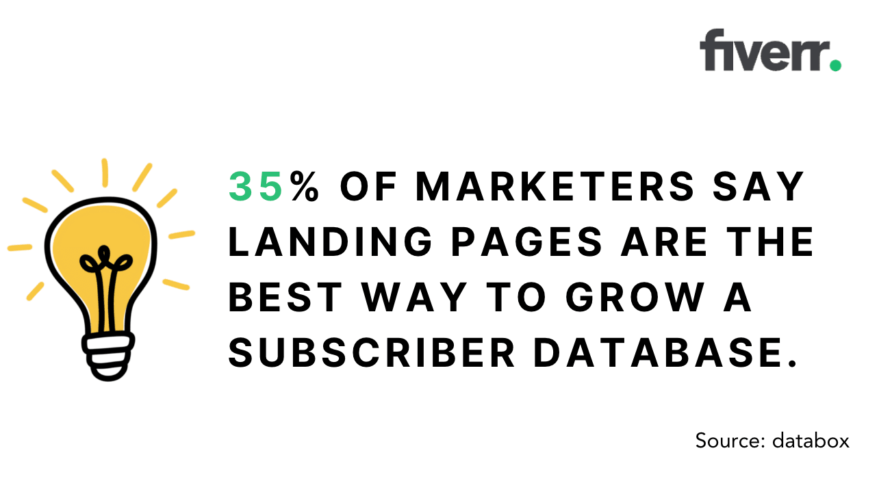
To get more subscribers: 35% of marketers say landing pages are the best way to grow a subscriber database.
Promote something new: These pages are highly targeted, so your new product can be the star of the show. 68% of marketers use more than 5 landing pages.
Build your brand: Find new audiences with targeted advertising. If your landing page has an email sign-up form, the average conversion rate is 23%.
Create customer segments: You can use multiple landing pages to test advertising strategies and target different demographics or languages in your website content.
Fiverr
TIP: You can use a landing page builder for a quick and easy solution. Or, ask a Fiverr freelancer for help.
When should you use landing pages?
Here are some instances where you would need to invest in a landing page:
Segmented promotional offers: Promotions aimed at different segments of your customers require separate landing pages. For example, you may have a discount for new customers, those who have signed up for a free trial, or high-tier plan members.
Multiple products: When you have more than one item for sale, create separate pages for different contexts and target audiences.
Multiple traffic sources: If you plan to run a marketing campaign across multiple channels, such as email and social media, you can use a separate landing page for each traffic source.
TIP: Creating separate pages lets you adjust the campaign’s call-to-action, SEO copy, and design to match the intended audience.
Hire a web designer on Fiverr
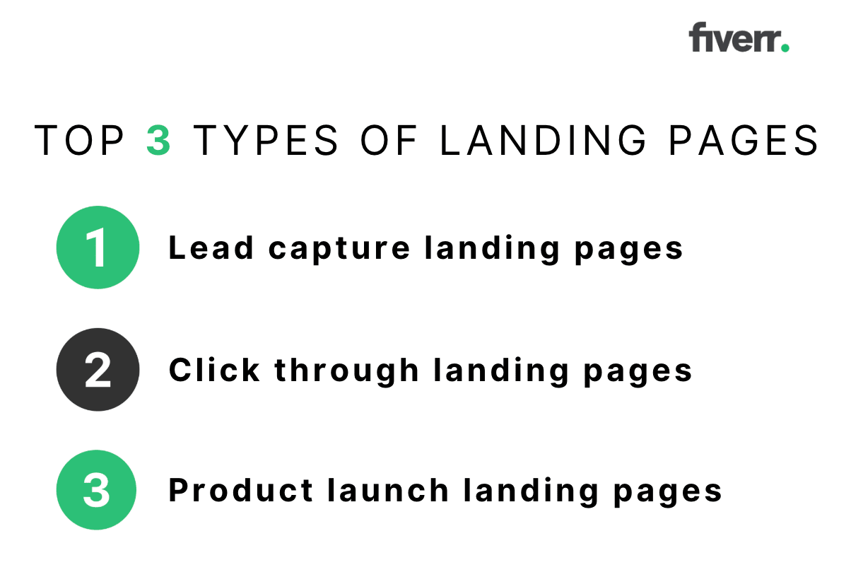
Types of landing pages
There is no one-size-fits-all approach for every brand. The type of page you create will depend on your marketing goals. Some of the most common options include:
Lead capture
A lead capture page is designed to collect information from potential customers. This type of landing page should include a form for visitors to complete.
The information you collect will depend on your goals. For example, a simple form with “name” and “email” fields may be enough if you want to grow your email database. Or, if you are trying to gain sales, you may also need their phone number and ZIP code.
Of course, most people won’t give out their personal details for free. In exchange, you will need to offer an incentive, such as a free ebook, 30-day trial, discount code, or gift.
If you only need email addresses, try a squeeze page instead. This prompts visitors to share their email only if they want to go any further.
Fiverr
Click-through pages
Click-through landing pages direct visitors to another destination. There is no form, just a strong call-to-action (CTA) encouraging them to click.
E-commerce websites commonly use these. For example, the CTA may be “Buy Now” with a link to the shopping page. Software companies often use a “Try the Demo” or “Sign Up for a Free Trial” CTA.
The color of the CTA button on your click-through page can make a difference. The most popular button colors are red, blue, green, and orange.
Product launch
A successful product page will get people excited about your latest offering. It should have everything customers need to know, including:
High-quality product photography
Product details and specifications
Pricing information
Product launch date
Reviews and testimonials
Depending on the product type and your goals, you can also use video in your landing page design.
Find a marketing strategy specialist for hire
10 best practices for creating landing pages
Before your page goes live, consider these 10 best practices for landing pages.
1. Have a single call to action
These pages are highly focused, so the message needs to be clear. Think about the purpose of the page and only include one call to action message.
Why? A CTA directs visitors to the next step. If you have more than one, it will give them mixed messages. Having multiple offers can cause your conversion rate to drop by a massive 266%.
This Netflix page has one simple goal — to get subscribers. The message is short and clear. All visitors need to do is enter their email address and hit “Get started.”
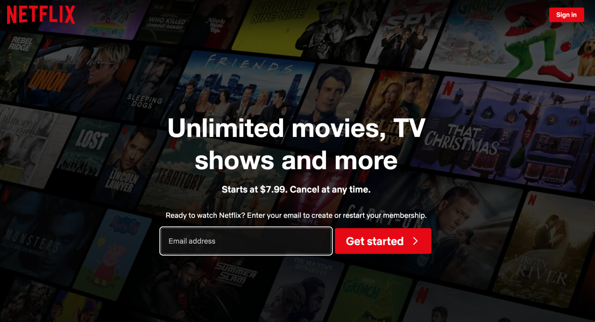
Netflix
Even though Netflix has multiple plans, this page is only about taking the first step.
2. Provide a clear visual hierarchy
Use visual hierarchy to guide the eyes of your visitors to information in order of priority.
You can do this with a range of design elements, including:
Headings
Font weight
Boxes
Colors
Images
White space
Let’s say the hook is, “Save money on your power bills.” This can be a bold heading, prompting the reader to learn more.
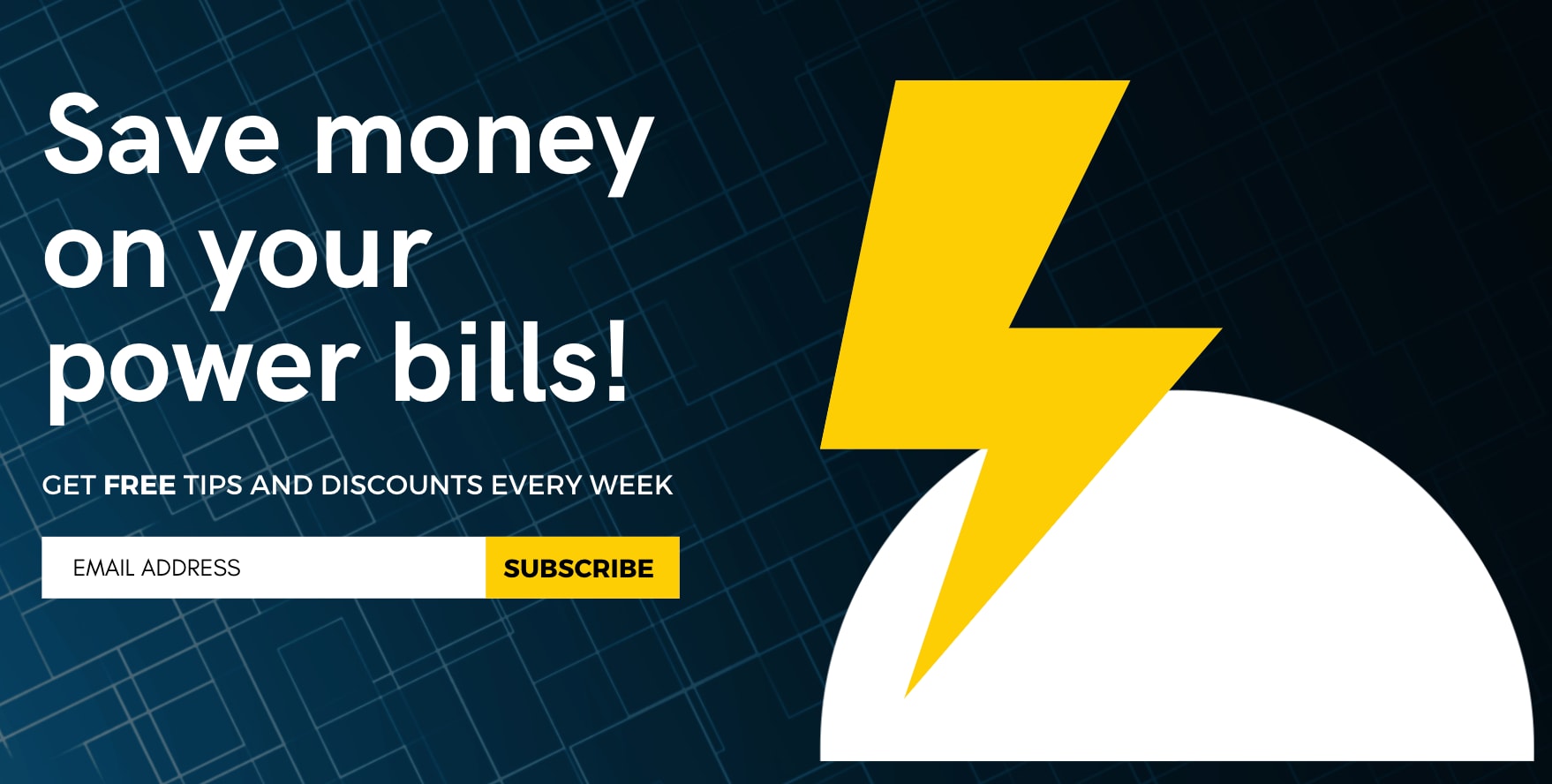
Canva
A yellow-colored call-to-action pops on a dark background and is hard to miss.
Remember, the saying “short and sweet” rings true. Keep your content clear and to the point while still conveying the necessary information to help your visitors convert. Think shorter sentences, bulleted lists, and very few (if any) chunky paragraphs.
3. Optimize for conversions
You should optimize landing pages for different device types. Whether someone is viewing it on a mobile phone or computer, it should be fast-loading, visually appealing, and easy to read.
One area to focus on is page speed. You can use a free tool like PageSpeedInsights to see how quickly the page loads.
You should aim for less than 4 seconds. Why? If you can get the load time down to less than 1 second, the conversion rate will be at its peak. If it takes 2 seconds, it will drop by 6% and continue to get worse as load time increases.
You can use a template or design software to create a web and mobile-responsive page. Or, avoid the stress altogether and ask a Fiverr web designer.
Find a Conversion Rate Optimization (CRO) Expert for Hire
4. Add a thank you page
When people fill out a form on your landing page, make sure you say thank you. This confirmation will tell them that the form was submitted successfully.
It can be a simple “Thank you for subscribing” or something more personalized. Here is an example from the online fashion store Hello Molly.
The first page promises a 10% off code when you subscribe to the mailing list.
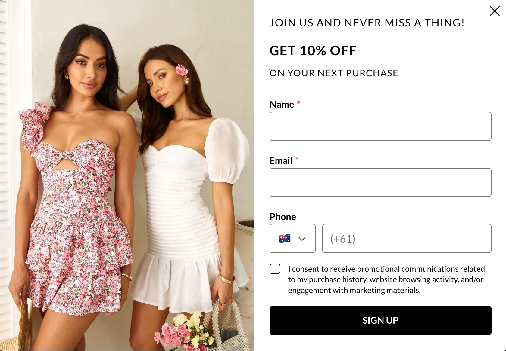
Hello Molly
Hit submit, and you will be taken to a welcome page. Because subscribers get the code instantly without having to check their email, it encourages you to add something to the cart immediately.
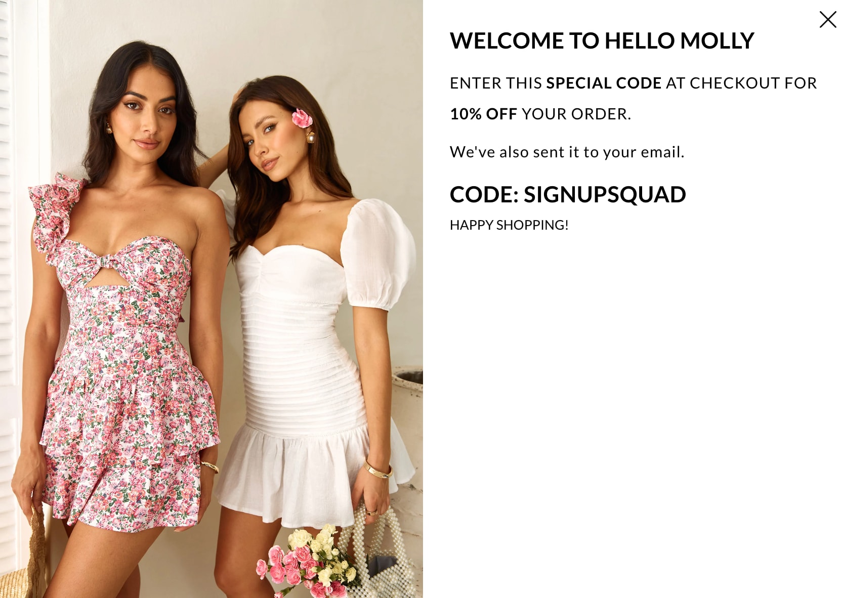
Hello Molly
Do your research to understand your target audience and customize the thank you page to suit their needs.
5. Collect demographic data
Visitor data is invaluable, so make sure you get the most from the web analytics you collect. Use your lead-capture landing page to learn more about your target demographic.
Everything from age to location to marital status can help you understand your audience and build a picture of who they are.
Details from your tracking and reporting can help you plan targeted campaigns based on pain points and customize your language, graphics, product offerings, and more.
6. Link out to other marketing channels
While you don’t want to clutter your landing page, linking to other marketing channels can be beneficial.
If it’s a lead generation page, use automation to add the visitor’s details to your email marketing list when they hit the CTA button.
You can also include small buttons that link to your social media pages, such as Facebook, TikTok, and Instagram. You can also embed video reviews from influencers to make the content stand out.
7. Match the content to the ad copy
Match your content, including the sales copy, design, and desired action, to the ads you run across your social channels and search engines.
If you promise your visitor one thing and don’t deliver, it can harm your brand.
A Google search for the email newsletter platform Mailchimp brings up an ad for a competitor called MailerLite. You get exactly what you expect when you click on the landing page.
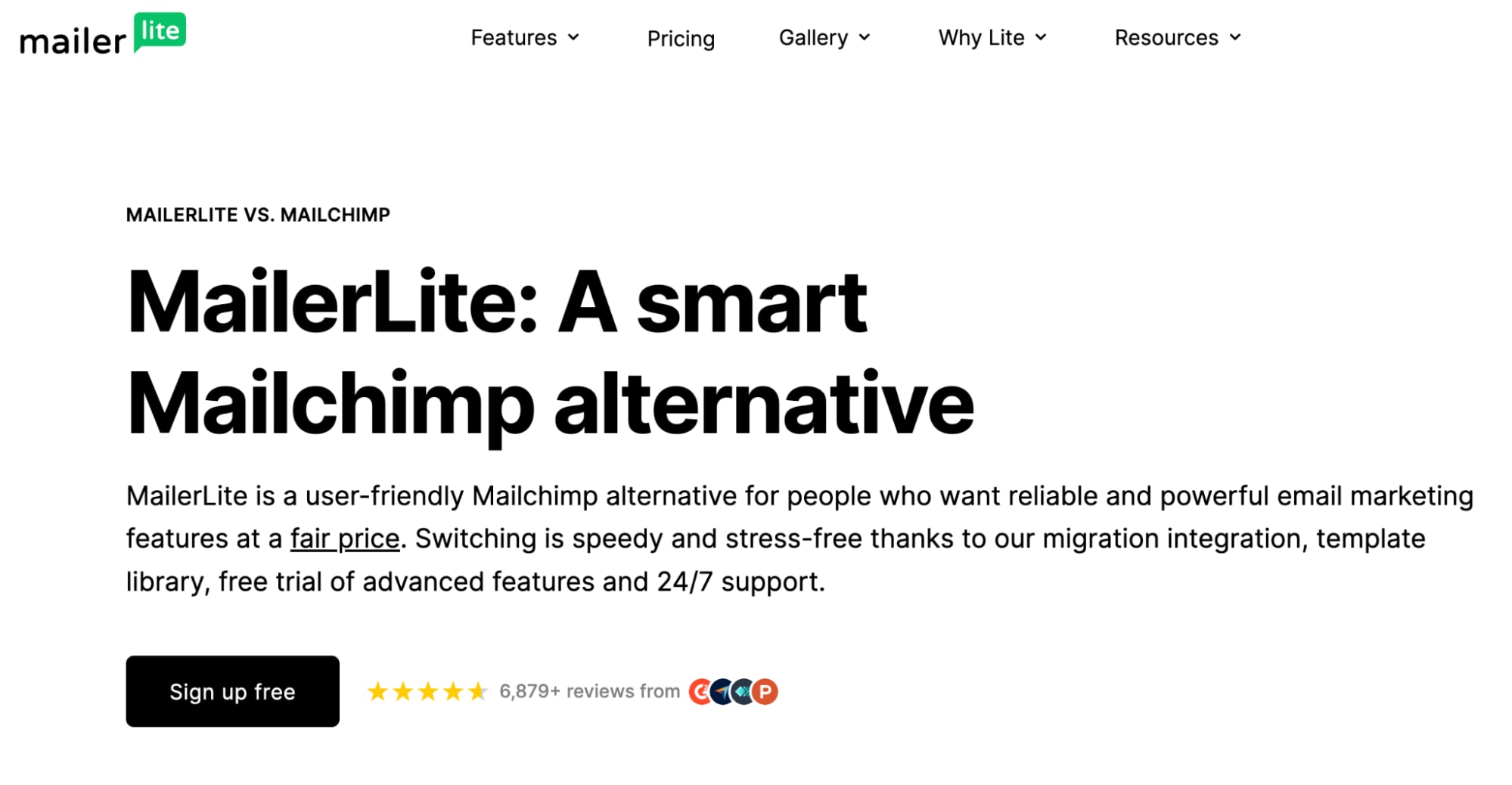
MailerLite
The page's copy is direct. Like the ad promises, it starts with why it’s “a smart Mailchimp alternative” and how easy it is to switch.
8. Use visual clues
Encourage visitors to keep reading with visual cues like arrows, animations, bullet points, illustrations, or headings.
Use bold, colorful, and/or 3D CTA buttons so they stand out from the rest of the content.
Remember to place the most important information above the fold. This is the part of the page a visitor can see before they need to scroll. It’s prime real estate on a landing page and where you have the best change of increasing conversions. Elements to include above the fold are the headline, hero image, unique sales proposition, and call-to-action.
Find a UX Designer for Hire
9. Include testimonials
You can include social proof on your landing page if you are selling something. Short testimonials, reviews, or videos of happy customers talking about their experience can prove that your product or service is the real deal.
Try to include the customer’s portrait, full name, location, and date of purchase (with their permission) to prove their authenticity.
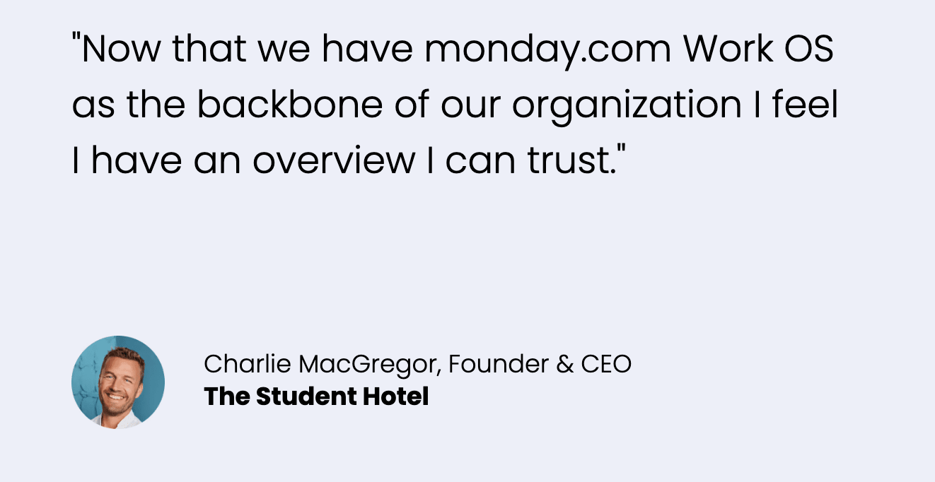
Monday.com
Pair this with lifestyle shots of your product in action so that viewers can imagine themselves as customers.
10. Remove distractions
An effective landing page will be free of distractions and focus on the key message. So, avoid adding navigation links, ads from external websites, and popups.
Attention ratio refers to the number of potential actions your visitor can take on a single web page (links to click) versus the actions you want them to take to convert.
Realistically, your home page design could have an attention ratio of 20:1, as there are 20 other options for them to click through to, rather than that single ‘Sign Up’ or ‘Buy Now’ button.
A landing page, on the other hand, aims for an attention ratio of just 1:1. Because there is only one action for the visitor to take, there are fewer distractions. So, you can expect a higher conversion rate.
Hire top-tier marketers and designers on Fiverr today
If you don’t have experience, try a website builder or hire a professional web designer. Rest assured, Fiverr creators can customize a dedicated landing page for every occasion.
A copywriter can help plan the perfect page content, while UX design services will focus on the user experience. Graphic designers can support you with imagery, and SEO experts can help you with on-page SEO optimization.
Using Fiverr comes with safety features such as payment processing and reviews. You can chat with freelancers before committing and choose experts who meet your budget, location, and design style.
Landing page FAQs
What is the purpose of a landing page?
A landing page is a tool marketers use to push one specific action. The standalone web page is where visitors land after clicking an advertisement.
It can boost sales, collect leads, grow your email database, get paid subscribers, and more.
What is the difference between a website and a landing page?
A standard page will contain multiple links and bodies of text to encourage visitors to explore your website.
A landing page, on the other hand, is designed with just one goal in mind—the call to action. It will be free from distractions such as navigation, leading to a higher conversion rate.
What is an example of a landing page?
A good landing page will convert visitors into customers or subscribers. Landing page examples include:
A webinar expression of interest form
A form to collect customer contact information
A free download of an ebook, case study, or whitepaper
A page that promotes a new product or service
Do I need a landing page if I have a website?
Yes, if you want to create a customized marketing campaign, you will need a landing page. This can be on your existing domain, but make sure it is free from navigation menus, heavy content, and links.
Creating separate pages lets you adjust the campaign’s call-to-action, copy, and design to match the intended audience.
Is a landing page and a sales page the same thing?
The short answer is that all sales pages are landing pages, but not all landing pages are sales pages.
Sales pages are transactional, as their number-one goal is to encourage the visitor to purchase.
Not all landing pages have the option for the visitor to buy. For example, some include an opt-in freebie, such as an ebook, in exchange for the visitor’s details. This way, they can be added to a company’s marketing funnel.
Related Guides
")

I have over 8 years of experience writing quality, SEO friendly content. I live in a beautiful regional town in Australia with my husband and three children. I can write confidently in both Australian and US styles and can give you the tone of voice that best suits your brand. Working in a digital agency has given me the opportunity to grow my skills and I can write about almost anything! Don't believe me? Give me a challenge! I look forward to working with you. Anna
