Turn a Broken Link into an Opportunity with Effective 404 Page Design
Your comprehensive guide to creating an effective 404 page. Complete with examples, best practices, and essential elements.
 February 12, 2025
 12 minute reading
It doesn’t take much to land on a 404 page. A simple typo in the URL, such as /shpe instead of /shop, or deleted content is enough to signal the “page not found” error.
But a missing resource doesn’t have to be a dead end. Your 404 error pages can be an integral part of your web design and your opportunity to help visitors find what they are looking for. The right strategy will build trust while keeping those valuable eyeballs on your site.
The question is, how do you transform a broken link into a functional page? There are a few key features that every 404 page should have. From search boxes to branding, we’ll cover everything you need to know in this guide.
What is a 404 page?
The 404 error code is probably something you have seen before. It’s a message that appears when a web page fails to load.
A 404 is triggered when the link in the address bar doesn’t match anything on the website. This may be because the URL was mistyped or the page has been deleted or moved.
In some cases, it may be more than a user error. For example, there may be issues with the domain name server (DNS), user file permissions, plugins, or themes.
Elements of an effective 404 page
Don’t think a non-existent page should be a priority? Think again. If someone has made it to your website, a broken link may send them running to the competition.
The key to retaining visitors in this situation is an effective 404 page. It should be clear, easy to navigate, and feel like it’s “meant to be there.”
Let’s take a look at some of the essential elements you should include in this page design:
Clear error explanation
You shouldn’t assume that everyone knows what a 404 error is. Try to be clear about why they have landed there — without causing any alarm.
If we look at allkinds, the 404 page doesn’t scream, “Warning get me out of here.” Instead, the brand has gone for an “Oops, this page cannot be found!” message with bold text. Visitors know straight away that they’ve taken a misstep, but it’s no big deal because they still have options.
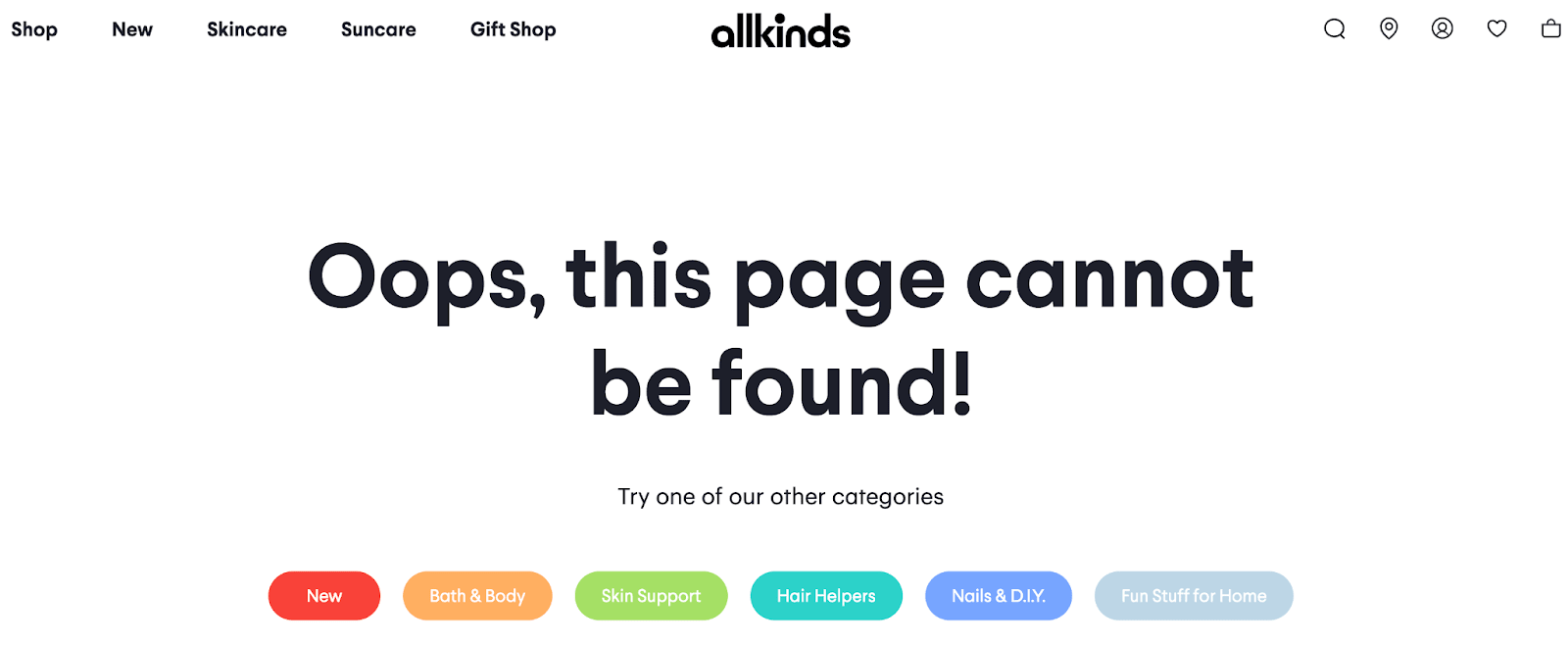
allkinds
Remember, the error message should be friendly and reassuring. It should also be short, sweet, and to the point. So, avoid filling the page with large bodies of text.
Navigation and search bars
Add navigation and search bars to your 404 page. When you have a clear error message, search function, and links to popular pages — you will encourage visitors to stay on the site.
Here is an example from Fiverr. If you accidentally type in the wrong URL or reach a broken page, you’ll get a 404 page like this one:
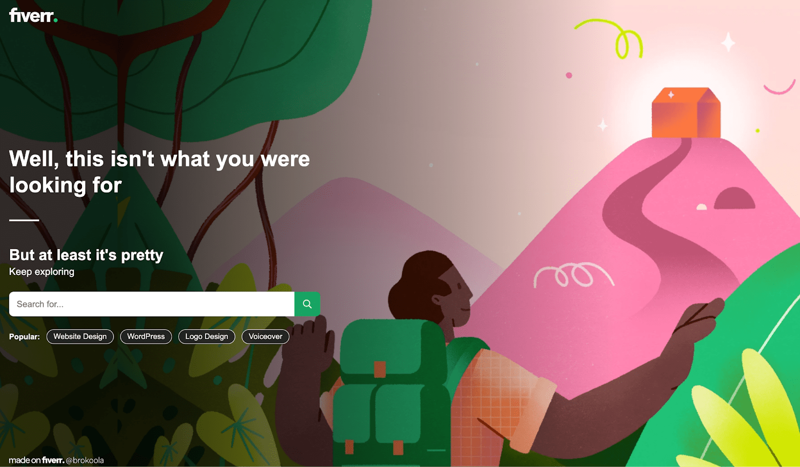
Fiverr
Why does it work? The design has all the essential elements, including a white search box and alternate page suggestions.
It also uses the Fiverr logo and colors for consistency, and there’s a touch of humor that fits with the brand.
Brand consistency
Businesses that focus on brand consistency can see up to 20% more revenue growth. Every page of your website should have your logo, color scheme, and fonts — including the 404 page.
Here’s an example. White Fox Boutique is a fashion brand that has a following of young, fun-loving people. While the clothes can be worn at any age, the apparel has become a hit for tweens, teens, and 20-somethings.
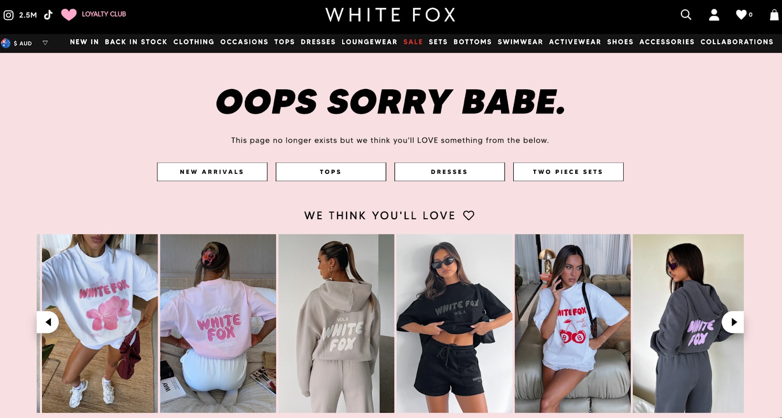
White Fox
White Fox knows its audience, and this comes across on the 404 page. It has the same colors and fonts as the rest of the website, and the headline “Oops Sorry Babe.” is on-brand.
Mobile responsive
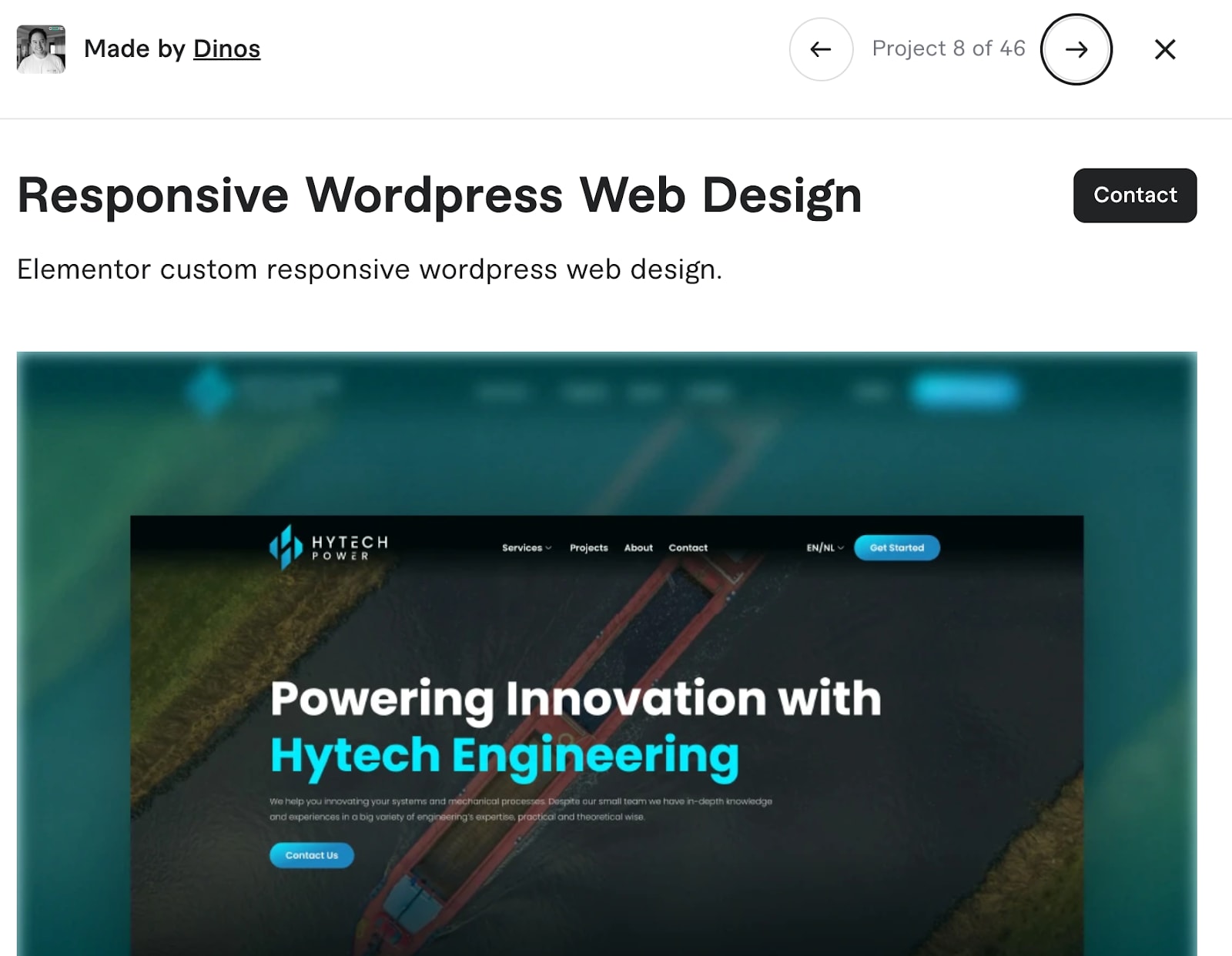
People use a range of devices, so your 404 should be adaptable. Dinos is a Fiverr Pro creator and founder of Core Concepts Design. We asked him to talk about all things mobile.

Fiverr
He says:
“A mobile-friendly website design refers to a website that is optimized for viewing and navigation on mobile devices, such as smartphones and tablets. It ensures that the user experience is smooth, accessible, and visually appealing across a variety of screen sizes and devices.”
Dinos says there are many considerations when creating a mobile-friendly design. These include:
Responsive layout: The website layout adjusts dynamically to fit different screen sizes. Whether viewed on a smartphone, tablet, or desktop, the content automatically resizes and rearranges for optimal readability and usability.
Touch-friendly navigation: Mobile devices use touchscreens, so navigation elements (like buttons, menus, and links) are designed to be easy to tap. This includes using larger buttons and avoiding small, difficult-to-click links.
Fast loading speed: Mobile-friendly sites are optimized to load quickly, even with slower mobile data connections. This may involve minimizing large images, using compressed files, and reducing unnecessary scripts.
Readable text: Text is displayed in a size and format that is easily readable without zooming. Font sizes and line heights are adjusted to ensure good readability on small screens.
Simplified content: Mobile-friendly designs often feature simplified layouts and less text, making it easier for users to find what they need without scrolling excessively.
Accessible features: Features like forms, pop-ups, and images are optimized for mobile use, making sure they work smoothly on small screens. For example, forms might be adjusted for easier input using mobile keyboards.
Avoidance of flash and pop-ups: Flash is not supported on many mobile devices, and pop-up ads or menus can be disruptive on small screens, so these are typically avoided in mobile-friendly designs.
Fiverr
Of course, these rules should apply to the entire web design — the 404 error page is only one piece of the puzzle.
404 page best practices
We have already shared the key elements, and now it’s time to discuss the best practices. Here are 15 ways to improve your 404, with page examples.
1. Be Clear
A 404 page is not the place for an essay. Every word matters, and you should use clear, crisp language.
Here is an example from Uber. There’s a quick apology, followed by a course of action.
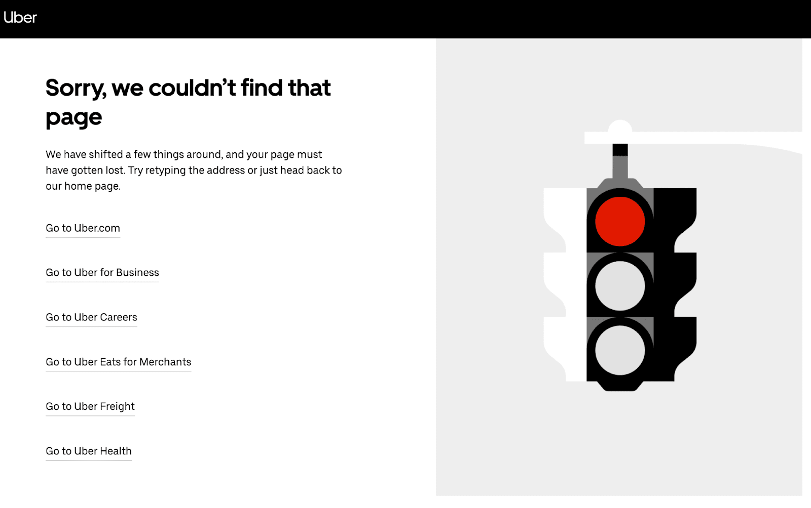
Uber
Visitors can return to the homepage or access a few popular links.
2. Limit the color palette
Your 404 page is there to share information, so don’t overwhelm your visitors with color. Instead, stick to a simple palette that fits with your brand.
In this example from game developer Blizzard, there is a winter theme. The colors used are limited to white and blue.
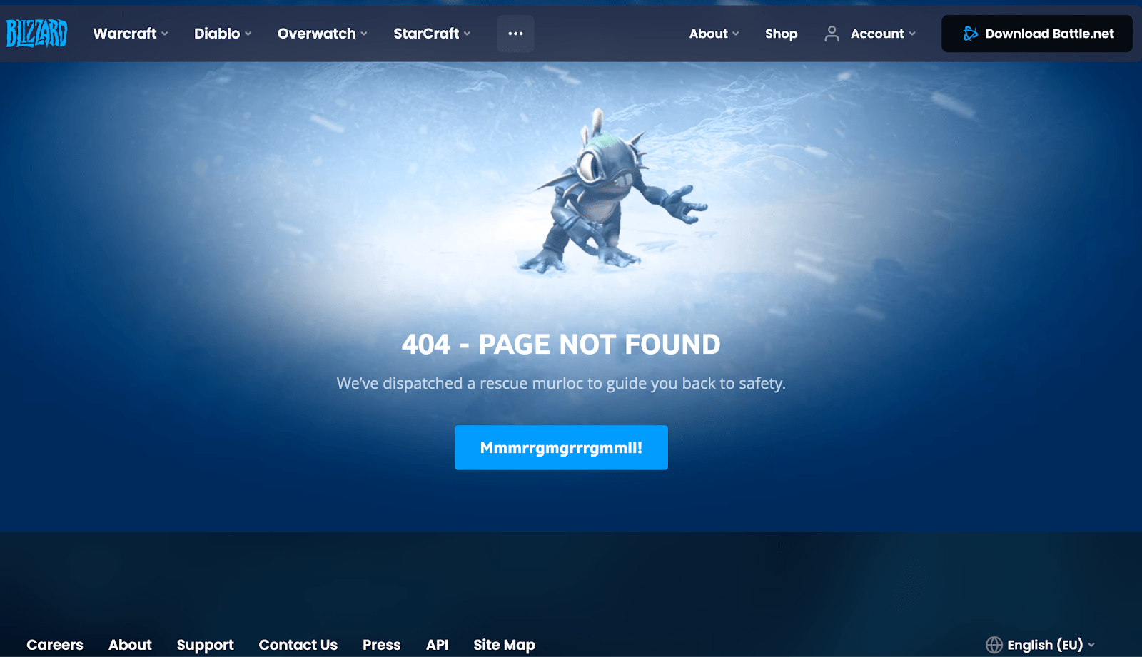
Blizzard
To make this stand out, Blizzard treats this as a landing page. The character is animated, and the CTA is a “Mmmrrgmgrrrgmmll!” (a playful reference to the iconic murloc sound from World of Warcraft), which gamers will appreciate.
3. Add visuals
While text should be minimal, you can make the page more interesting with relevant graphics.
Look at Lego. This has to be one of the coolest 404 pages on the internet, and one that you don’t mind landing on:
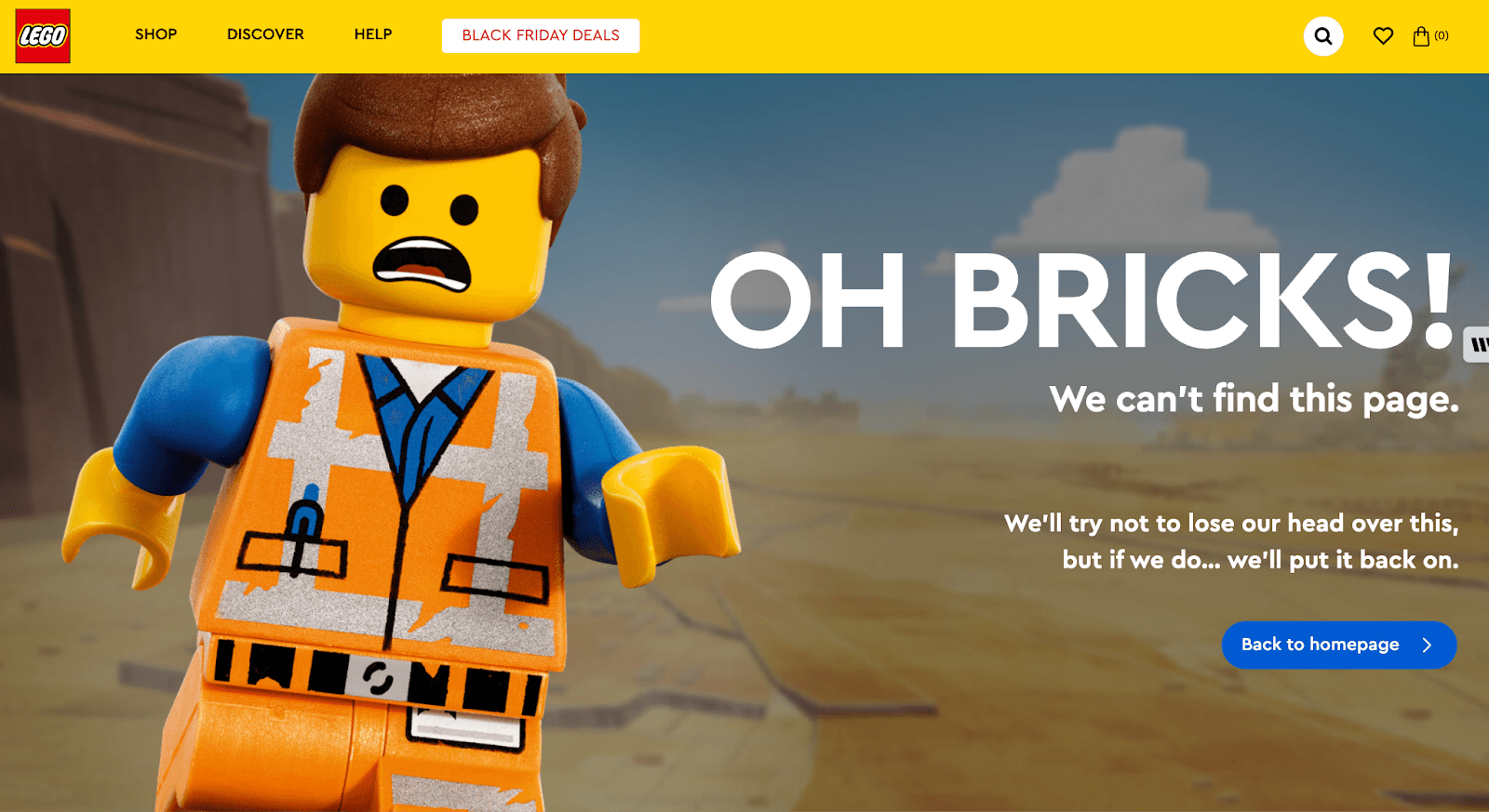
Lego
The toy brand has combined a Lego-style construction worker with a fun “Oh Bricks! We can’t find this page” copy.
4. Master the hierarchy
In design, we often talk about hierarchy, which is something to consider for your 404 page. You should emphasize the most important information so the eyes of your visitors are naturally drawn there first.
The error message will be number one, so make it stand out as a heading or bolded text. Here’s an example from the Foxtel website:
Foxtel
Then, you can highlight your CTA (call to action), navigation links, or search box depending on the preferred next steps.
5. Show your brand personality
Don’t be afraid to put some fun into your 404 page. As long as the message is clear, you can put your own spin on things.
Look at the music streaming service Spotify. It uses the phrase “404s and heartbreaks” with a retro spinning record player:
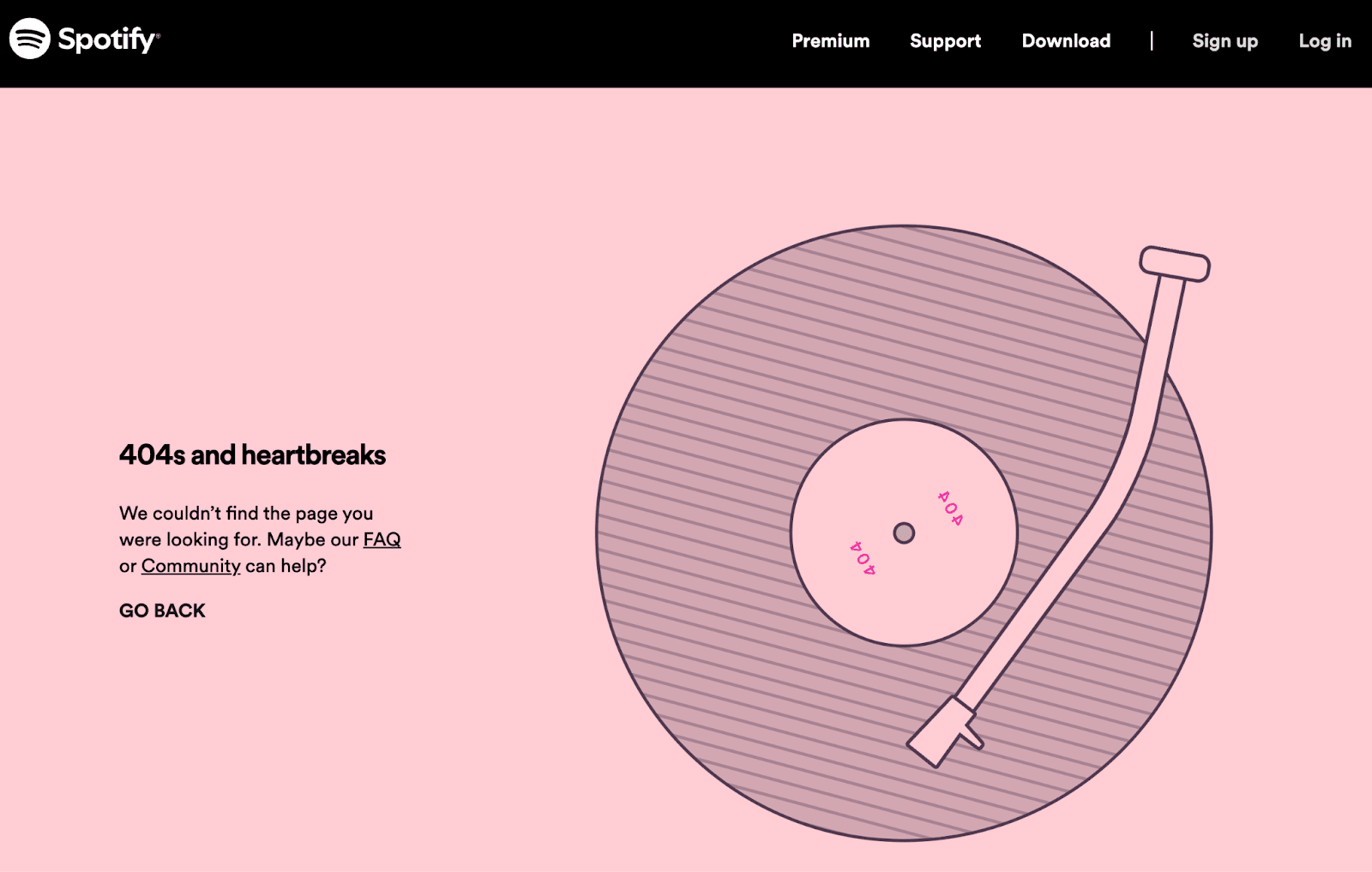
Spotify
It’s professional — but also fun and on-brand.
6. Link to the homepage
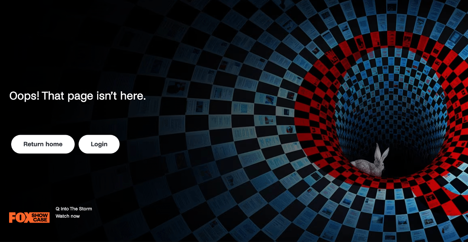
You know that navigation options can help visitors find an alternate page. But sometimes a trip to the homepage is all they need — so consider adding a home button.
This is the focus of Netflix's 404:
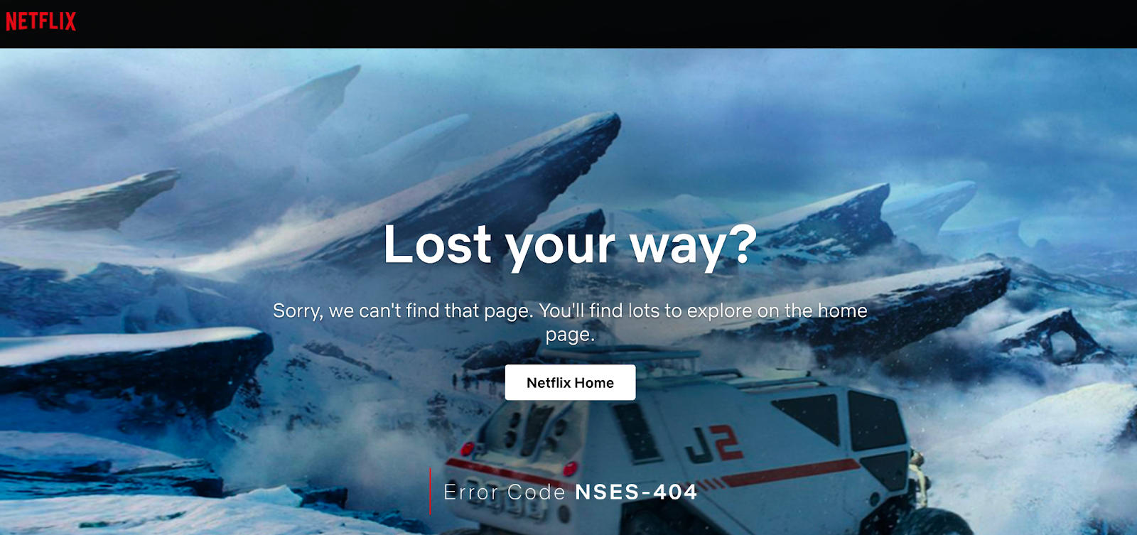
Netflix
The platform has a white button with the CTA “Netflix Home” to make it simple for visitors.
7. Set up redirects
If a page has been moved permanently, it makes sense to set up a redirect. This way, your visitors won’t see a 404 page — they’ll just be automatically sent where they want to go.
There are multiple ways to set up redirects. If you are using a platform like WordPress, there are plugins available. Alternatively, you can log in to the site’s cPanel, modify the .htaccess file, or update the HTML Meta tag.
Find a Web Designer for Hire
8. Avoid tech jargon
Most people don’t want to know about hypertext transfer protocols and status codes. Save the tech jargon for the experts and stick to straightforward language.
Apple is an innovative tech company, but they still understand the end user:
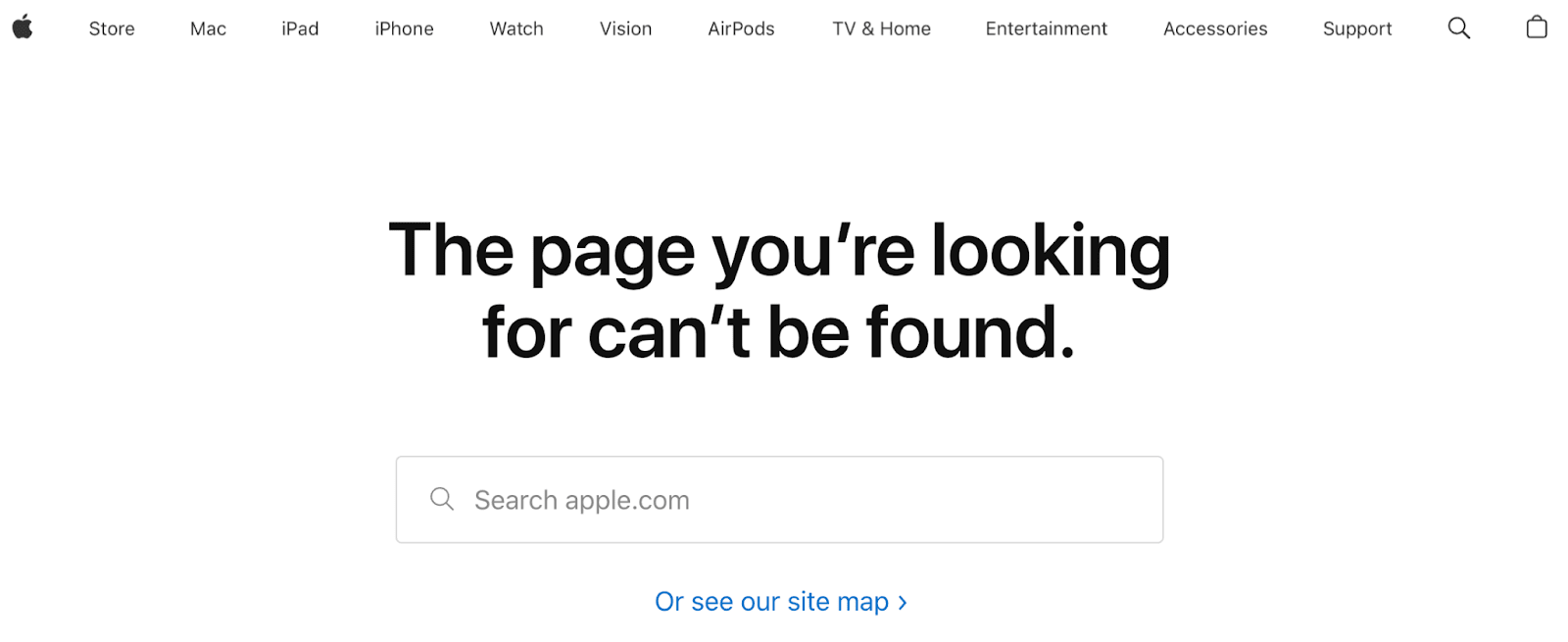
Apple
Most people 10 or older will be able to comprehend this message.
9. Use accessible design
The 404 page should be inclusive and accessible to everyone. This means if someone has an accessibility need, such as a visual impairment, they should have the same user experience.
Try the POUR acronym for accessibility. It stands for:
P - Perceivable
O - Operable
U - Understandable
R - Robust
There are a range of strategies you can use. These include color contrast, alt image tags, and keyboard navigation.
10. Reconsider SEO
Your 404 page won’t be indexed by Google, so the usual SEO rules don’t apply. For example, you don’t have to worry about regularly updating content or gaining backlinks.
But this doesn’t mean you should ignore SEO completely. A 404 page means there is an error, so you should try to fix the underlying cause. While a few hits to this page are forgivable — it shouldn’t be a regular occurrence.
11. Use legible typography
To get the message across, make sure you use typography that’s easy to read. Look for letters with plenty of spacing, and avoid cursive styles.
Check out the PlayStation website:
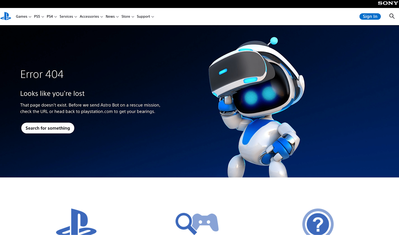
Playstation
Some of the best fonts for the web include:
Arial
Helvetica
Tahoma
Georgia
Roboto
San-Serif typefaces are always a good choice. So, if you get stuck, try to find one you like from this family.
12. Try a QR code
If you have an app, a 404 can be an opportunity for promotion. If users view the page on a device, a “download” button can send them straight to the app store.
Or, if your page is viewed on a computer, a QR code is a convenient option. Here is an example from Vogue:
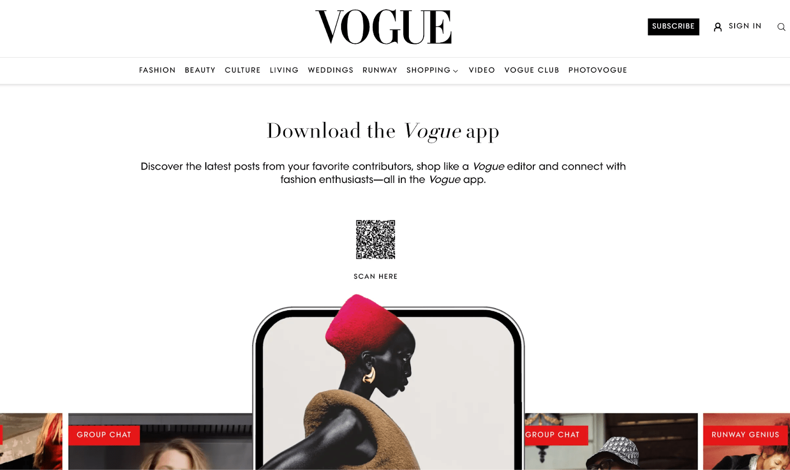
Vogue
As you can see, the fashion magazine doesn’t even acknowledge the error — it’s all about the app.
13. Connect with emotion
The tone of your 404 page should be relatable. Sure, there was an issue, but landing on the wrong page isn’t the end of the world.
Text and cute characters will connect with people and make them feel like you are in this together.
Meet poor Roger from Moz. He’s lost:
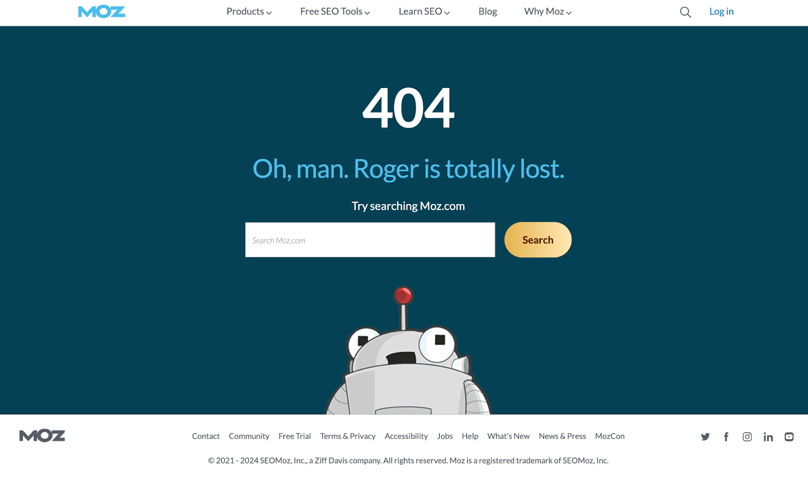
Moz
But it’s hard to be mad at a little robot, and most people will shrug off the error and move on to the search bar.
14. Include socials
Customers expect brands to offer multiple methods of communication. Social media is the next best thing if they can’t access your website.
Kids stationery brand Smiggle has four social media icons at the bottom of the 404 page:
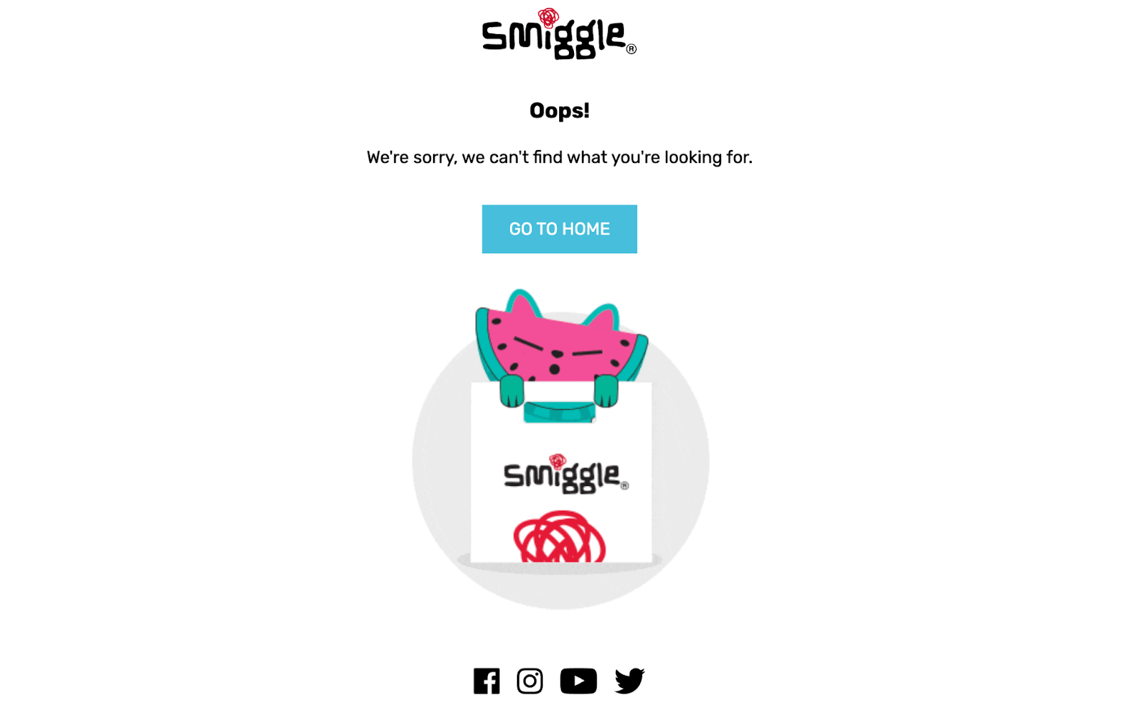
Smiggle
These are subtle and don’t detract from the message but give visitors another option. The brand focuses on its most popular socials, with Facebook, Instagram, YouTube, and X.
15. Track 404 events
A tool like Google Analytics will give you insights into these errors. For example, you can monitor which pages led visitors to a 404 and how often the error was received.
This information can help you flag any trends or website issues and reduce the number of broken links.
Find an Expert Developer to Fix your Website Bugs for Hire
How to create a 404 page
Ready to create your error page design? Here is a rundown of the steps you should take next.
Choose your platform
The way you create your 404 page will depend on which platform you are using.
You can customize this page if you use a WordPress template or have a site builder like Wix or Squarespace.
Alternatively, you can create a custom HTML page and upload it to the server.
Design your error page layout
Next, you will design the page. Make it consistent with the rest of your website, with the same header, footer, branding, and tone of voice.
Remember to focus on hierarchy and keep the text short and sweet.
If you have limited web or UI design skills, consider using the services of a professional. Fiverr has experts with various specialties, including web designers and graphic design consultants.
Add navigation and search features
A missing page doesn’t have to be the end. Give your visitors clear navigation and search features to encourage them to stay on-site.
Prioritize what is most important with a list of key links. It may be the homepage, popular articles, an ecommerce link, or your About Us page.
Test and implement your 404 page
Once your 404 page is ready, you should test it to make sure everything is working correctly.
There are free tools available, such as HTTP Status Code Checker. Put in a broken link to see which status code comes up:
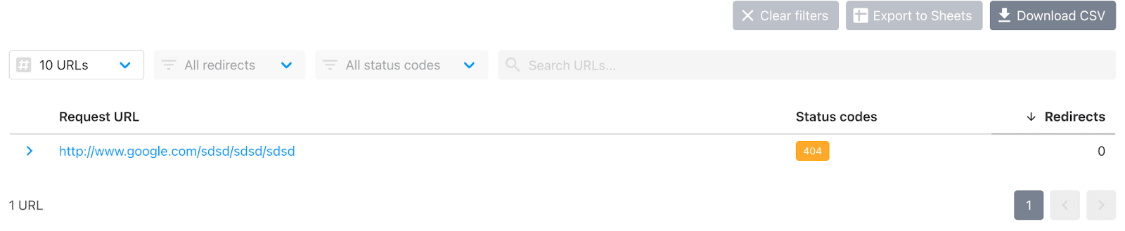
Http code checker
You can also type a bogus link into the URL bar to see where your visitors will land.
Make sure you have a tracking tool like Google Analytics to monitor the performance of the 404. And make updates as required.
Find a designer on Fiverr
If you don’t feel confident designing the 404 page yourself, a Fiverr creator can help. Find a web designer or consultant, and get a design that meets the needs of your target audience.
Most Fiverr creators are affordable. Whether you want to add a landing page, online store, or blog to the service — Fiverr makes it possible.
Find a Web Designer for Hire
404 page design FAQs
How do you design a 404 page?
Your visitors may see a confusing error message if you don’t have a custom 404 page. Some web builders have a built-in error page, which you can customize to suit your needs.
Alternatively, updating the HTML yourself is an option. It can be a complex project, so consider hiring someone who specializes in web design.
What does a good 404 page look like?
A good 404 page will have a clear heading that explains the issue in a few words. For example, “Oops, this page is broken.”
It should be an accessible design, with navigation links, search functions and brand consistency.
What is a 404 page used for?
A 404 page appears when a link is broken. It tells the user they have arrived at a website, but the specific page they requested does not exist.
What is the difference between a broken link and a 404 page?
A link is an address to a web page. If it is broken, the link was mistyped or points to a page that has been moved or changed.
This action loads a 404 error page.
Related Guides

I have over 8 years of experience writing quality, SEO friendly content. I live in a beautiful regional town in Australia with my husband and three children. I can write confidently in both Australian and US styles and can give you the tone of voice that best suits your brand. Working in a digital agency has given me the opportunity to grow my skills and I can write about almost anything! Don't believe me? Give me a challenge! I look forward to working with you. Anna
